
In this tutorial, you’ll learn how to generate synthetic data that follows a power-law distribution, plot its cumulative distribution function (CDF), and fit a power-law curve to this CDF using Python. This process is useful for analyzing datasets that follow power-law distributions, which are common in natural and social phenomena.
Prerequisites
Ensure you have Python installed, along with the numpy, matplotlib, and scipy libraries. If not, you can install them using pip:
pip install numpy matplotlib scipy
Step 1: Generate Power-law Distributed Data
First, we’ll generate a dataset that follows a power-law distribution using numpy.
import numpy as np

# Parameters
alpha = 3.0  # Exponent of the distribution
size = 1000  # Number of data points

# Generate power-law distributed data
data = np.random.power(a=alpha, size=size)
👉 How to Generate and Plot Random Samples from a Power-Law Distribution in Python?
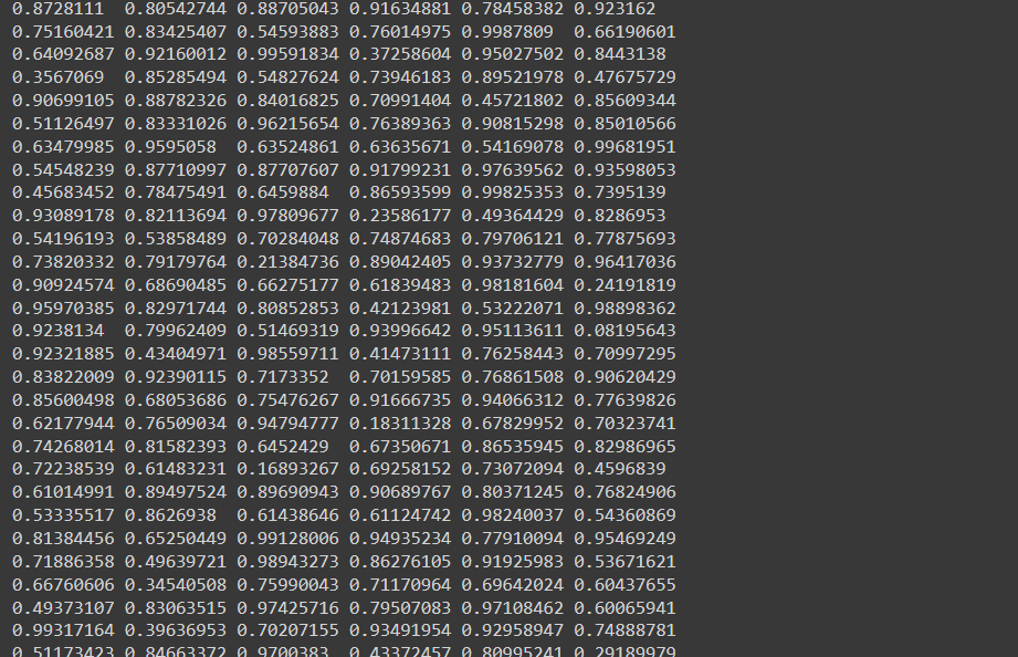
The data looks like this:
Let’s make some sense out of it and plot it in 2D space: 📈
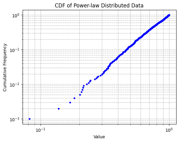
Step 2: Plot the Cumulative Distribution Function (CDF)
Next, we’ll plot the CDF of the generated data on a log-log scale to visualize its power-law distribution.
import matplotlib.pyplot as plt

# Prepare data for the CDF plot
sorted_data = np.sort(data)
yvals = np.arange(1, len(sorted_data) + 1) / float(len(sorted_data))

# Plot the CDF
plt.plot(sorted_data, yvals, marker='.', linestyle='none', color='blue')
plt.xlabel('Value')
plt.ylabel('Cumulative Frequency')
plt.title('CDF of Power-law Distributed Data')
plt.xscale('log')
plt.yscale('log')
plt.grid(True, which="both", ls="--")
plt.show()
The plot:
Step 3: Fit a Power-law Curve to the CDF
To understand the underlying power-law distribution better, we fit a curve to the CDF using the curve_fit function from scipy.optimize.
from scipy.optimize import curve_fit

# Power-law fitting function
def power_law_fit(x, a, b):
    return a * np.power(x, b)

# Fit the power-law curve
params, covariance = curve_fit(power_law_fit, sorted_data, yvals)

# Generate fitted values
fitted_yvals = power_law_fit(sorted_data, *params)
Step 4: Plot the Fitted Curve with the CDF
Finally, we’ll overlay the fitted power-law curve on the original CDF plot to visually assess the fit.
# Plot the original CDF and the fitted power-law curve
plt.plot(sorted_data, yvals, marker='.', linestyle='none', color='blue', label='Original Data')
plt.plot(sorted_data, fitted_yvals, 'r-', label='Fitted Power-law Curve')
plt.xlabel('Value')
plt.ylabel('Cumulative Frequency')
plt.title('CDF with Fitted Power-law Curve')
plt.xscale('log')
plt.yscale('log')
plt.grid(True, which="both", ls="--")
plt.legend()
plt.show()
Voilà! 👇
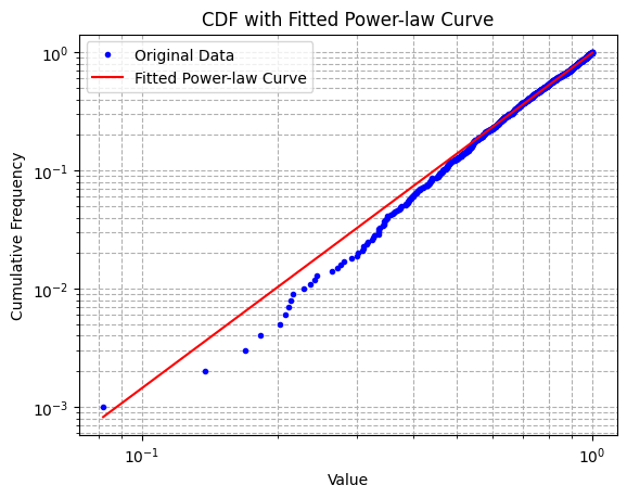
This visualization helps in assessing the accuracy of the power-law model in describing the distribution of the data.
Recommended article:
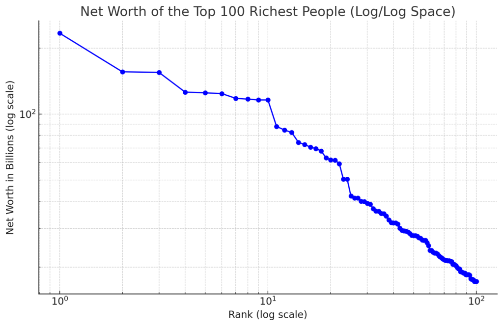
👉 Visualizing Wealth: Plotting the Net Worth of the World’s Richest in Log/Log Space