
To generate a 3D waterfall plot with colored heights create a 2D sine wave using the NumPy meshgrid() function, then apply a colormap to the heights using Matplotlib’s Normalize function. The plot_surface() function generates the 3D plot, while the color gradient is added using a ScalarMappable object.
Here’s a code example for copy and paste: 👇
import numpy as np
import matplotlib.pyplot as plt
from matplotlib import cm

# Create the X, Y, and Z coordinate arrays.
x = np.linspace(-5, 5, 101)
y = np.linspace(-5, 5, 101)
X, Y = np.meshgrid(x, y)
Z = np.sin(np.sqrt(X**2 + Y**2))

# Create a surface plot and projected filled contour plot under it.
fig = plt.figure(figsize=(8, 6))
ax = fig.add_subplot(111, projection='3d')

# Select Colormap
cmap = cm.viridis

# Norm for color mapping
norm = plt.Normalize(Z.min(), Z.max())

# Plot surface with color mapping
surf = ax.plot_surface(X, Y, Z, rstride=1, cstride=1, facecolors=cmap(norm(Z)), alpha=0.9, linewidth=0)

# Add a color bar which maps values to colors
m = cm.ScalarMappable(cmap=cmap, norm=norm)
m.set_array(Z)
fig.colorbar(m)

ax.set_xlabel('X')
ax.set_ylabel('Y')
ax.set_zlabel('Z')
plt.show()
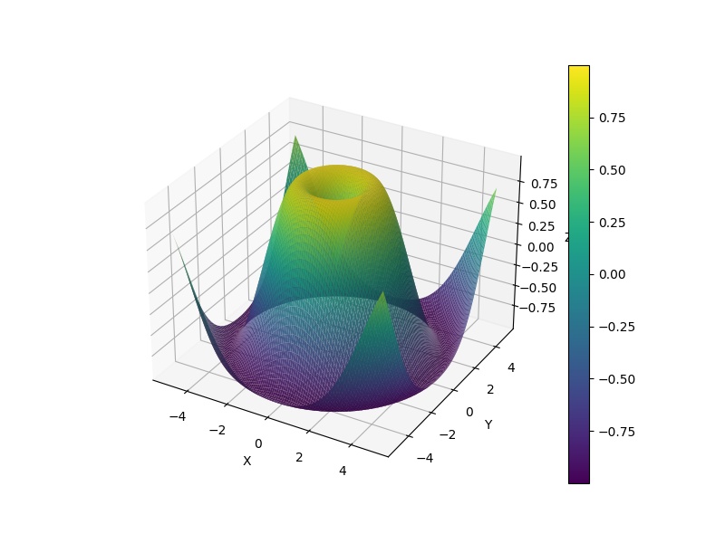
If you run this code in your Python shell, you’ll get a beautiful interactive 3D waterfall plot:
In your case you’ll probably need to replace the data with your own. Feel free to check out our guide on linspace() with video if you need some background there.
Let’s dive into the steps in the code to get this plot done next. 👇
Step 1: Import Libraries
import numpy as np
import matplotlib.pyplot as plt
from matplotlib import cm
Here we are importing the necessary libraries. Numpy is for numerical operations, Matplotlib’s pyplot is for plotting, and cm from Matplotlib is for working with colormaps.
Step 2: Generate Data
x = np.linspace(-5, 5, 101)
y = np.linspace(-5, 5, 101)
X, Y = np.meshgrid(x, y)
Z = np.sin(np.sqrt(X**2 + Y**2))
Here, linspace generates 101 evenly spaced points between -5 and 5 for both x and y.
You can watch our explainer video on the function here: 👇
💡 Recommended: How to Use np.linspace() in Python? A Helpful Illustrated Guide
The NumPy function meshgrid takes two 1D arrays representing the Cartesian coordinates in the x and y axis and produces two 2D arrays.
The Z array is a 2D array that represents our “heights” and is calculated by applying the sine function to the square root of the sum of the squares of X and Y, essentially creating a 2D sine wave.
Step 3: Prepare the Figure
fig = plt.figure(figsize=(8, 6))
ax = fig.add_subplot(111, projection='3d')
We first create a figure object, and then add a subplot to it. The '111' argument means that we want to create a grid with 1 row and 1 column and place the subplot in the first (and only) cell of this grid. The projection='3d' argument means that we want this subplot to be a 3D plot.
Do you need a quick refresher on subplots? Check out our video on the Finxter blog: 👇
💡 Recommended: Matplotlib Subplot – A Helpful Illustrated Guide
Step 4: Prepare Colormap
cmap = cm.viridis
norm = plt.Normalize(Z.min(), Z.max())
Here we’re choosing a colormap (cm.viridis), and then creating a normalization object (plt.Normalize) using the minimum and maximum values of Z. This normalization object will later be used to map the heights in Z to colors in the colormap.
Step 5: Plot the Surface
surf = ax.plot_surface(X, Y, Z, rstride=1, cstride=1, facecolors=cmap(norm(Z)), alpha=0.9, linewidth=0)
The method ax.plot_surface() plots the 3D surface.
- The arguments
X, Y, Zare the coordinates for the plot. - The
rstrideandcstrideparameters determine the stride (step size) for row and column data respectively, facecolorsparameter takes the colormap applied on the normalized Z,alphais used for blending value, between 0 (transparent) and 1 (opaque), andlinewidthdetermines the line width of the surface plot.
Step 6: Add a Color Bar
m = cm.ScalarMappable(cmap=cmap, norm=norm)
m.set_array(Z)
fig.colorbar(m)
A ScalarMappable object is created with the same colormap and normalization as our surface plot. Then we associate this object with our Z array using the set_array function. Finally, we add a color bar to the figure that represents how the colors correspond to the Z values.
Step 7: Set Labels and Show the Plot
ax.set_xlabel('X')
ax.set_ylabel('Y')
ax.set_zlabel('Z')
plt.show()
Here, we’re setting the labels for each axis (X, Y, Z). Finally, plt.show() is called to display the plot. The plot will remain visible until all figures are closed.
Instead of using the plot.show() function to see the output, you can use the plt.savefig('output.jpeg') statement to save it in a file 'output.jpeg'.
💡 Recommended: Matplotlib — A Simple Guide with Videos