To generate random samples from a power-law distribution in Python, use the numpy library for numerical operations and matplotlib for visualization.
- 📱 Computation: Specifically, you can use the
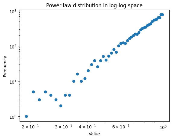
numpy.random.powerfunction, which draws samples from a power-law distribution with a specific exponent. - 📈 Visualization: After generating the samples, it’s beneficial to visualize them in a log-log space to observe the characteristic straight-line behavior of power-law distributions. This visualization helps in understanding the distribution’s properties and confirming its power-law nature.
Here’s a minimal code example to generate and visualize random samples from a power-law distribution:
import numpy as np
import matplotlib.pyplot as plt

# Parameters
a = 5  # Shape parameter
samples = 10000  # Number of samples

# Generate random samples
data = np.random.power(a, samples)

# Visualization in log-log space
counts, bins = np.histogram(data, bins=50)
bins_center = (bins[:-1] + bins[1:]) / 2
plt.loglog(bins_center, counts, marker='o', linestyle='none')

plt.xlabel('Value')
plt.ylabel('Frequency')
plt.title('Power-law distribution in log-log space')
plt.show()
First, we import the necessary libraries: numpy for generating the power-law distributed samples and matplotlib.pyplot for plotting.
The a parameter is the shape parameter of the power-law distribution, controlling the steepness of the distribution. The samples variable defines how many random values we want to generate.
np.random.power(a, samples) generates an array of samples drawn from a power-law distribution with the shape parameter a.
To visualize the distribution in log-log space, we first compute the histogram of the data using np.histogram, which returns the counts and the bin edges.
We calculate the center of each bin for plotting purposes (bins_center) and then plot the histogram using plt.loglog to create a log-log plot. This is crucial for visualizing power-law distributions as they appear as straight lines in log-log plots.
Finally, we label the axes and show the plot with plt.show().
Creating Power Law Distribution Without Library Such As NumPy

To create samples from a power-law distribution without a library, we use the inverse transform sampling method, where we generate uniform random samples and apply the inverse of the distribution’s cumulative distribution function (CDF) to these samples. This approach mathematically transforms uniformly distributed random numbers into numbers that follow the desired power-law distribution, based on the power-law’s specific characteristics and parameters.
Here’s the code:
import random
import matplotlib.pyplot as plt

def generate_power_law_samples(alpha, size=1000, xmin=1):
    """Generate samples from a power-law distribution using the inverse transform sampling method."""
    samples = []
    for _ in range(size):
        u = random.random()  # Uniform random sample from 0 to 1
        x = xmin * (1 - u) ** (-1 / (alpha - 1))
        samples.append(x)
    return samples

def plot_rank_frequency(samples):
    """Plot samples in log-log space using rank-frequency."""
    # Sort samples in descending order
    sorted_samples = sorted(samples, reverse=True)
    # Generate ranks
    ranks = range(1, len(sorted_samples) + 1)
    # Plotting
    plt.loglog(ranks, sorted_samples, marker='o', linestyle='none')
    plt.xlabel('Rank')
    plt.ylabel('Sample Value')
    plt.title('Power-law distribution rank-frequency plot in log-log space')
    plt.show()

# Generate samples
alpha = 2.5  # Shape parameter of the power-law distribution
samples = generate_power_law_samples(alpha, 10000)

# Plot rank-frequency in log-log space
plot_rank_frequency(samples)
This code generates samples from a power-law distribution using the generate_power_law_samples function, as before.
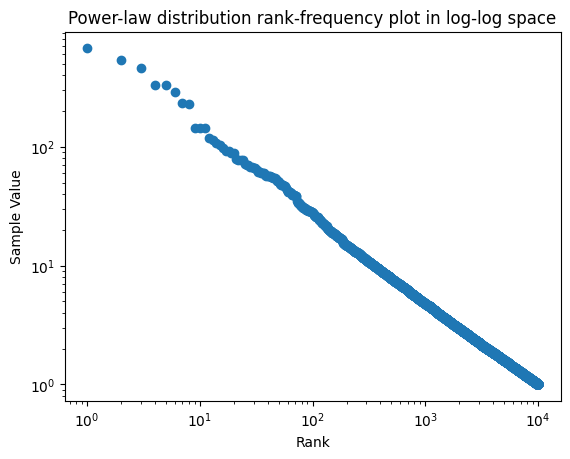
The plot_rank_frequency function sorts the samples in descending order and then generates their ranks. In a rank-frequency plot, each point’s x-coordinate is its rank (i.e., its position in the sorted list), and its y-coordinate is the sample value itself.
We plot these points in a log-log space using plt.loglog(). This type of plot is useful for observing the power-law behavior of the distribution, where a linear relationship in log-log space indicates a power-law distribution.
The plot’s x-axis represents the ranks of the samples, and the y-axis represents the sample values, both on logarithmic scales. This visualization technique is effective for highlighting the characteristics of power-law distributions.

