
Summary: The best way to plot a Confusion Matrix with labels, is to use the ConfusionMatrixDisplay object from the sklearn.metrics module. Another simple and elegant way is to use the seaborn.heatmap() function.
Note: All the solutions provided below have been verified using Python 3.9.0b5.
Problem Formulation
Imagine the following lists of Actual and Predicted values in Python.
actual_data = \
       ['apples',  'pears',   'apples',
        'apples',  'apples',  'pears',
        'oranges', 'oranges', 'apples',
        'apples',  'apples',  'apples',
        'apples',  'apples',  'pears',
        'apples',  'oranges', 'apples',
        'apples',  'apples']

predicted_data = \
      ['oranges', 'pears',   'apples',
       'apples',  'apples',  'pears',
       'oranges', 'oranges', 'apples',
       'apples',  'apples',  'apples',
       'apples',  'apples',  'pears',
       'apples',  'oranges', 'oranges',
       'apples',  'oranges']
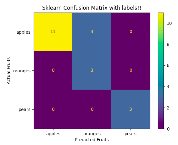
How does one plot a Confusion Matrix such as the one shown below?
 |
Background
The predicted data shown above, is often the outcome of data fed into a Classification Model. In the perfect world of perfect models, the predicted data should match the actual data. But in the real world, the predicted data and the actual data rarely match. How does one make sense of this vexing Confusion? You got it!! One plots a Confusion Matrix. A Confusion Matrix is a way to measure the performance of a Classifier.
This blog demonstrates how easy it is to plot a Confusion Matrix with labels. As always, the Python Community keeps developing simpler and intuitive ways to code. The SKLearn Metrics module provides excellent scoring functions and performance metrics. The Matplotlib and Seaborn libraries provide excellent visualizations. This blog demonstrates how to use these libraries to plot a Confusion Matrix with labels.
I Am Confused!! How Do I Plot A Confusion Matrix With Labels, Quickly!!
Are you already familiar with the concepts of Confusion matrices and Visualization? If so, then the solution proposed below is the fastest and easiest way to plot the data. The starting point is the Classified Data (i.e. actual v/s predicted). This means one does not have to incur the overhead of having to use the Classifier again. This method demonstrates how to tweak the ConfusionMatrixDisplay object itself. This gets us the results we want, in a quick and efficient way. This method is easier because we are using the same sklearn.metrics module to…
- Create the Confusion Matrix.
- Plot the Confusion Matrix.
The reader should use the code below, to plug in their actual and predicted values. The comments explain what does what in the code. For simplicity, the data shown below has 3 types of fruits. These are apples, oranges, and pears. Note that because these are strings, SKLearn orders them in alphabetical order. Hence, the ordering of the tick labels should match this alphabetical sorting order too. i.e. display_labels=['apples', 'oranges', 'pears']. For example, if one uses apples, pears, and tomatoes as data instead, then use display_labels=['apples', 'pears', 'tomatoes'].
If at any point all this information is making you hungry, stop right here and go grab a real fruit to eat.
Ok, now that you are eating your fruit, let’s make another point. A Confusion Matrix can show data with 2 or more categories. This example shows data that has 3 categories of fruit. Remember to list all the categories in the 'display_labels', in the proper order.
Save the following code in a file (e.g. fruitsSKLearn.py).
## The Matplotlib Library underpins the Visualizations we are about to
## demonstrate.
import matplotlib.pyplot as plt

## The scikit-learn Library (aka sklearn) provides simple and efficient
## tools for predictive data analysis.
from sklearn.metrics import confusion_matrix, ConfusionMatrixDisplay

## For Simplicity, we start from the data that was already generated
## by the Classifier Model.

## The list 'actual_data' represents the actual(real) outputs
actual_data = \
       ['apples',  'pears',   'apples',
        'apples',  'apples',  'pears',
        'oranges', 'oranges', 'apples',
        'apples',  'apples',  'apples',
        'apples',  'apples',  'pears',
        'apples',  'oranges', 'apples',
        'apples',  'apples']

## The list 'predicted_data' represents the output generated by the
## Classifier Model. For the perfect Classification Model, the Predicted
## data would have exactly matched the Actual data. But as we all very
## well know, there is no such thing as the ‘perfect Classification Model’.
## Hence the Confusion Matrix provides a way to visualize and make
## sense of the accuracy of the Classification Model.
predicted_data = \
      ['oranges', 'pears',   'apples',
       'apples',  'apples',  'pears',
       'oranges', 'oranges', 'apples',
       'apples',  'apples',  'apples',
       'apples',  'apples',  'pears',
       'apples',  'oranges', 'oranges',
       'apples',  'oranges']

## Create the Confusion Matrix out of the Actual and Predicted Data.
cm = confusion_matrix(actual_data, predicted_data)

## Print the Confusion Matrix.
print(cm)

## Create the Confusion Matrix Display Object(cmd_obj). Note the
## alphabetical sorting order of the labels.
cmd_obj = ConfusionMatrixDisplay(cm, display_labels=['apples', 'oranges', 'pears'])

## The plot() function has to be called for the sklearn visualization
## code to do its work and the Axes object to be created.
cmd_obj.plot()

## Use the Axes attribute 'ax_' to get to the underlying Axes object.
## The Axes object controls the labels for the X and the Y axes. It
## also controls the title.
cmd_obj.ax_.set(
                title='Sklearn Confusion Matrix with labels!!',
                xlabel='Predicted Fruits',
                ylabel='Actual Fruits')

## Finally, call the matplotlib show() function to display the visualization
## of the Confusion Matrix.
plt.show()
Next, run the code as follows, to plot the Confusion Matrix.
$ python
$ python -V
Python 3.9.0b5
$ python fruitsSKLearn.py
[[11  3  0]
 [ 0  3  0]
 [ 0  0  3]]
$
It displays the following visualization. Note the labels 'Actual Fruits' and 'Predicted Fruits'.
 |
Is It True That There Is Always Another Way in Python, To Do The Same Thing?
Well!! Let’s say ‘almost’ always!! In this section, we use the Seaborn Library to plot the Confusion Matrix with labels. Seaborn is a data visualization library based on matplotlib.
In this method too, one can use the Classified Data as the starting point. One can see upon examining the Seaborn code, that it is very much like the SKLearn code. This is because both of these libraries are under-pinned by the Matplotlib library. In both of these cases, one modifies attributes of the underlying axes object. SKLearn modifies the underlying axes object through the ConfusionMatrixDisplay object. Whereas the Seaborn heatmap() function actually creates and returns the underlying axes object. The code then modifies this axes object, directly.
As in the previous section, the reader should plug in their own actual and predicted data. Remember to tweak the labels as needed. Save the modified code in a file (e.g. fruitsSeaborn.py)
## The Matplotlib Library underpins the Visualizations we are about to
## demonstrate.
import matplotlib.pyplot as plt

## The scikit-learn Library (aka sklearn) provides simple and efficient
## tools for predictive data analysis.
from sklearn.metrics import confusion_matrix

## The Seaborn Library provides data visualization. In this example, it plots
## the Confusion Matrix
import seaborn as sns

## For Simplicity, we start from the data that was already generated
## by the Classifier Model.

## The list 'actual_data' represents the actual(real) outputs
actual_data = \
       ['apples',  'pears',   'apples',
        'apples',  'apples',  'pears',
        'oranges', 'oranges', 'apples',
        'apples',  'apples',  'apples',
        'apples',  'apples',  'pears',
        'apples',  'oranges', 'apples',
        'apples',  'apples']

## The list 'predicted_data' represents the output generated by the
## Classifier Model. For the perfect model, the Predicted data would
## have exactly matched the Actual data. But as we all very well know
## there is no such thing as the ‘perfect Classification Model’.
predicted_data = \
      ['oranges', 'pears',   'apples',
       'apples',  'apples',  'pears',
       'oranges', 'oranges', 'apples',
       'apples',  'apples',  'apples',
       'apples',  'apples',  'pears',
       'apples',  'oranges', 'oranges',
       'apples',  'oranges']

## Create the Confusion Matrix out of the Actual and Predicted Data.
cm = confusion_matrix(actual_data, predicted_data)

## Print the Confusion Matrix
print(cm)

## Call the heatmap() function from the Seaborn Library.
## annot=True annotates cells.
## fmt='g' disables scientific notation.
## The heatmap() function returns a Matplotlib Axes Object.
ax = sns.heatmap(cm, annot=True, fmt='g');

## Modify the Axes Object directly to set various attributes such as the
## Title, X/Y Labels.
ax.set_title('Seaborn Confusion Matrix with labels!!');
ax.set_xlabel('Predicted Fruits')
ax.set_ylabel('Actual Fruits');

## For the Tick Labels, the labels should be in Alphabetical order
ax.xaxis.set_ticklabels(['apples', 'oranges', 'pears'])
ax.yaxis.set_ticklabels(['apples', 'oranges', 'pears'])

## Finally call the matplotlib show() function to display the visualization
## of the Confusion Matrix.
plt.show()
Next, run the code as follows, to plot the Confusion Matrix.
$ python
$ python -V
Python 3.9.0b5
$ python fruitsSeaborn.py
[[11  3  0]
 [ 0  3  0]
 [ 0  0  3]]
$
It displays the following visualization. Note the labels ‘Actual Fruits’ and ‘Predicted Fruits’. Also note that the default color schemes are different when compared with the SKLearn library. In the Seaborn library, the color scheme is managed by the ‘cmap’ parameter of the heatmap() function.
 |
Conclusion
Python is like the Dungeon’s and Dragon’s video game. There are vast numbers of nooks and crannies to explore. The above examples show two easy ways to plot a Confusion Matrix with labels. Python Coder’s have developed several other fancy methods to do the same thing. They range from super simple to unnecessarily complex. The point is, there is a lot of information on the internet about Python. Do your research to find the most elegant and easiest way.
While one is learning Python, there is no getting away from Elbow Grease (aka. Hard-brain-work). Hard-brain-work needs a lot of energy and nourishment. So go eat those apples, oranges and pears while you tackle the Python.
Programmer Humor

Finxter Academy
This blog was brought to you by Girish Rao, a student of Finxter Academy. You can find his Upwork profile here.
Reference
All research for this blog article was done using Python Documents, the Google Search Engine and the shared knowledge-base of the Finxter Academy and the Stack Overflow Communities.
The following libraries and modules were also explored during the creation of this blog.