
- Do you wonder how to visualize clusters in Python?
- Are you looking for the best visualize tool to understand clusters?
- What is a Dendrogram?
- How to plot Dendrogram using Python?
If you answered any of these questions with “yes!”, this article is for you! 🙂
Here’s what you’ll learn:
- The initial segment will make you understand the meaning of visualization terms like hierarchal clustering in simplest terms.
- Then you will learn about the process of drawing the Dendrogram.
- The article will show you the merits and demerits of the dendrogram and the three Python libraries to plot the dendrogram. These three libraries you learn about to plot dendrogram are
plotly,scipyandmatplotlib. - Finally, we will undertake a short visual analysis of the data.
Dendrogram, the graphical tool, is employed to visualize clusters. Let’s learn more about it.
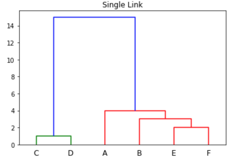
What Is a Dendrogram?
Definition:
A dendrogram is a visual representation of the hierarchical relationship between clusters. It is the output derived from Hierarchical Clustering.
The term ‘Dendrogram’ arises from greek words where ‘déndron’ means tree and grámma means drawing a mathematical diagram.
The diagram starts from the root node (Refer to Image 1 of C and D), which gives birth to many nodes that connect with other nodes (Refer to Image 1 of the blue line).
Hierarchical clustering is a method that groups similar data into a bundle called clusters. Each cluster contains similar objects or data and is different from other clusters.
How to Draw a Dendrogram?
Let us understand the step-by-step process of drawing a dendrogram yourself.
Step 1: List the Items.
The first step is to gather and list the item as per the following table to create a dendrogram:
| ITEMS |
| Abyssinian |
| American Curl |
| Bengal |
| Bactrian |
| Dromedary |
| Arabian |
| Warmbloods |
| American Quarter |
| Fuji |
| Honeycrisp |
| Gala |
| Alphonse |
| Edward |
| Kesar |
The items above contain Cat, Camel, Horses, Apple, and Mango varieties grown in the US and Non-US regions.
The objective of a dendrogram is to group similar items into Cats, Camel, Horse, Apple, Mango. Then it is grouped into a bigger cluster: Animals and Fruits.
The cluster Cats will separate the US grown and Non-US grown cats into smaller groups.
Step 2: Order and write the list as per similar groups.
The next step is to order similar items into different clusters.
Here we are ordering cat, camel, horse, apple, and mango varieties.
Firstly, write the things grown in the US on the drawing board. The rest of the items produced in Non-US regions is as follows.
In the below image 2, you can see that for cat variety, the first US-grown Cat, “American Curl,” is written, then the Non-US grown cat is written second “Abyssinian” and third “Bengal.”
Similarly, it is grouped likewise for Camel, Horse, apple, and Mango varieties.
Step 3: Draw the line connecting two units of the group.
This step will draw connecting lines for Non-US grown items groups.
Abyssinian and Bengal Cat are connected. Bactrian and Dromedary camel is connected and so on.
Refer to the Image 3.

Step 4: Draw the line connecting for two or three units of the group.
In this step, we can draw a line connecting from the US-grown items to the group of Non-US grown items as shown in below Image 4:

The American Curl cats grown in the US connects with Non-US grown cats.
After drawing connecting lines for similar clusters, each group of connected clusters forms a bigger group of Cat, Camel, Horse, Apple, and Mango Clusters.
Step 5: Draw the line connecting larger groups.
At this final step, we are connecting these larger groups of cat camel, horse, apple, and mango to 2 bigger groups or 2 clusters: Animals and Fruits.
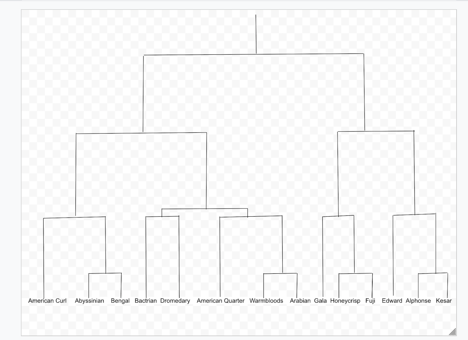
Congratulations! Finally, you have drawn Dendrogram Chart. Before you learn how to plot it in python, let’s know about the Positive and Negative Points of Dendrogram.
Positive and Negative Points of Dendrogram
Positive Points
(1) The main benefit of a dendrogram is the ease of understanding hierarchical clusters.
It provides us with a clear understanding of the similarity of data groups.
Also, it helps us identify other groups of data dissimilar from others.
For example, suppose you have 100 patients visit your clinic every day. You need to understand how many patients who have specific flu symptoms consult with the doctor. With the help of a dendrogram, you can group patients based on different symptoms. From the diagram, it is easy to spot how large patients have flu symptoms.
(2) Another benefit for dendrogram is straightforward to code in most programming languages.
The Python standard library has specific functions to create a dendrogram. We can get dendrogram output with a single line of code.
Now you are not required to open the paint to draw the nodes, edges, or branches!
(3) Dendrogram the cluster visualization helps the business decision-making process.
For example, let’s say you own online stores serving all customers in New York city. When customers place an order from your website, you arrange for delivery from your three warehouses located in remote areas.
It has logistics problems when you deliver the products to customers far away from the warehouse. So you group customers based on locations and then plot the dendrogram.
You then decide that you can serve those customers near the warehouse. Service the customers, located far away through a dealer or can be eliminated.
Negative Points
- The main drawback is that you cannot visualize multi-dimension data. For example, we can plot with two dimension data such as products sales and customer groups. But it is difficult to plot three-dimension data with additional components such as private or public customers.
- The dendrogram cannot be visualized with the missing data. The data must be edited with estimated value or deleted entirely to plot the dendrogram.
- You can plot a dendrogram with a single type of data only. It is challenging to group qualitative and numerical data simultaneously and plot dendrogram.
Dendrograms in Python
Data Construction
Learning Curve Data for Year 11 Cluster Table
| Subject | Overall | SCHA | SCHB | SCHC | SCHD | SCHE | SCHF | SCHG | SCHH |
| English | 80.49% | 100.00% | 100.00% | 100.00% | 100.00% | 0.00% | 100.00% | 74.49% | 52.86% |
| Mathematics | 60.52% | 99.26% | 0.00% | 100.00% | 100.00% | 0.00% | 0.00% | 0.00% | 97.14% |
| Accounting | 7.62% | 0.11% | 3.77% | 0.51% | 3.57% | 1.43% | 2.86% | 4.08% | 12.86% |
| Science | 76.98% | 100.00% | 100.00% | 100.00% | 100.00% | 0.00% | 100.00% | 69.39% | 27.14% |
| Agriculture/Horticulture | 8.69% | 1.48% | 7.55% | 7.19% | 0.00% | 14.29% | 0.00% | 14.29% | 24.29% |
| Health & Physical Education | 54.42% | 99.26% | 100.00% | 0.00% | 100.00% | 51.43% | 40.00% | 29.59% | 50.00% |
| Recreation | 4.12% | 0.74% | 3.77% | 13.67% | 0.00% | 0.00% | 2.86% | 2.04% | 2.86% |
| Geography | 0.13% | 8.89% | 3.77% | 14.39% | 23.21% | 1.43% | 8.57% | 17.35% | 7.14% |
| History | 22.10% | 8.15% | 0.32% | 25.18% | 100.00% | 4.29% | 45.71% | 12.24% | 8.57% |
| Economics | 8.84% | 10.37% | 1.89% | 10.07% | 19.64% | 0.00% | 17.14% | 6.12% | 8.57% |
| Computer Studies | 14.63% | 7.41% | 18.87% | 15.11% | 1.79% | 30.00% | 31.43% | 16.33% | 8.57% |
The source of the table “Learning Curve Data for Year 11” is taken from Journal titled Clustering students by their subject choices in the Learning Curves project written by Hilary Ferral. This journal paper was published in New Zealand Council For Educational Research.
The Education council aims to understand students’ preferences over different subjects to provide better education.
The researcher surveyed the students from different schools and gathered data on how many students preferred subject opted.
The final data is arranged using the hierarchal clustering tool and advanced statistics formulas. Actual data in the journal has more than 20 subjects. Here only a few subjects are selected to simplify and get a clear dendrogram diagram.
The SCHA and SCHB represent year 11 students belonging to different schools in the country.
- For example,1.48 % percentage of students belonging to SCHA schools prefer Agriculture/Horticulture subject.
- Likewise, 100% of students from SCH B prefer Science and Health & Physical Education subjects.
The table is inputted to the system through a data frame using Pandas Library.
Now let’s start plot dendrogram using the Python library.
Library 1: Plotly
First library is Plotly where you use plotly.figure_factory.create_dendrogram() function to plot dendrogram.
Here is the procedure.
Install Pandas and Plotly modules if you have not done before by the following command:
pip install pandas
pip install plotly
Next, Import the libraries as follows:
import pandas as pd
import plotly.figure_factory as ff
Figure Factory functions provide different plots such as Dendrogram, Hexagonal Binning Tile Map, Quiver Plots, and more.
Here you can use the DataFrame function to store cluster data.
Create subject dictionary from the title given in Table 2 as follows:
subject = {'Subject': ['English','Mathematics','Accounting',
                       'Science','Agriculture/Horticulture',
                       'Health & Physical Education','Recreation',
                       'Geography','History','Economics','Computer Studies']}
You can create the results dictionary to store the percentage preference of subjects opted by different schools ignoring the overall results.
results ={
            'SCHA': [100.00,99.30,0.10,100.00,1.50,99.30,0.70,8.90,8.20,10.40,7.40],
            'SCHB': [100.00,0.00,3.77,100.00,7.55,100.00,3.77,3.77,0.32,1.89,18.87],
            'SCHC': [100.00,80.00,0.51,1.00,7.19,0.00,13.67,14.39,25.18,10.07,15.11],
            'SCHD': [100.00,100.00,3.57,100.00,0.00,100.00,0.03,23.21,100.00,19.64,1.79],
            'SCHE': [0.00,0.00,1.43,0.00,14.29,51.43,0.00,1.43,4.29,0.00,30.00],
            'SCHF': [100.00,0.00,2.86,100.00,0.00,40.00,2.86,8.57,45.71,17.14,31.43],
            'SCHG': [74.49,0.00,4.08,69.39,14.29,29.59,2.04,17.35,12.24,6.12,16.33],
            'SCHI':[52.86,97.14,12.86,27.14,24.29,50.00,2.86,7.14,8.57,8.57,8.57]
            }
Create DataFrame by the following command:
table = pd.DataFrame(results)
Then Dendrogram plotly figure is plotted by calling the create_dendrogram function as shown below.
den = ff.create_dendrogram(table,labels=subject['Subject'])
The table is the data frame used to plot the dendrogram. And the name of the subject is displayed on the x-axis using the labels attribute.
The labels have to be list data type. The value of the ‘Subject’ key in the results dictionary is the list of the subject’s names.
Finally, a new browser window opens with a dendrogram plotted by the following command (Refer to Image 6).
den.show()

Image 6.
Library 2: Scipy
The library Scipy uses function hierarchy.dendrogram() to plot the dendrogram.
Follow the below procedure.
Install Python libraries of Scipy and Matplotlib by the following code:
pip install scipy
pip install matplotlib
Import the python libraries as below:
import pandas as pd
from scipy.cluster import hierarchy
import matplotlib.pyplot as plt
Create subject list and results dictioary as follows:
subject = ['English','Mathematics','Accounting','Science','Agriculture/Horticulture','Health & Physical Education','Recreation','Geography','History','Economics','Computer Studies']
results ={
            'SCHA': [100.00,99.30,0.10,100.00,1.50,99.30,0.70,8.90,8.20,10.40,7.40],
            'SCHB': [100.00,0.00,3.77,100.00,7.55,100.00,3.77,3.77,0.32,1.89,18.87],
            'SCHC': [100.00,80.00,0.51,1.00,7.19,0.00,13.67,14.39,25.18,10.07,15.11],
            'SCHD': [100.00,100.00,3.57,100.00,0.00,100.00,0.03,23.21,100.00,19.64,1.79],
            'SCHE': [0.00,0.00,1.43,0.00,14.29,51.43,0.00,1.43,4.29,0.00,30.00],
            'SCHF': [100.00,0.00,2.86,100.00,0.00,40.00,2.86,8.57,45.71,17.14,31.43],
            'SCHG': [74.49,0.00,4.08,69.39,14.29,29.59,2.04,17.35,12.24,6.12,16.33],
            'SCHI':[52.86,97.14,12.86,27.14,24.29,50.00,2.86,7.14,8.57,8.57,8.57]
            }
Construct the Data Frame as follows:
table = pd.DataFrame(results)
Hierarchy Linkage functions perform hierarchical/agglomerative clustering.
z=hierarchy.linkage(table,'single')
The table is 1d data of percentages of subject preferred. The data in this function has to be 1D or 2D data of arrays. The method ‘single’ calculates the distance between clusters and uses statistical concepts called Nearest Point Algorithm.
Next lets plot dendrogram using hierarchy. dendrogram function as below:
dn = hierarchy.dendrogram(z,labels=subject,orientation='left’')
The z parameter is hierarchy clusters.
The labels parameter are the name of subjects to name the nodes.
The orientation of the figure is left to display labels clearly. You can see the root plots at the right side, and the branches go left side.
plt.show()
With the above command, a new window opens with the output of the dendrogram figure (Refer to Image 7).

Library 3: Seaborn
The third Python library is seaborn with sns.clustermap() function you get heatmap with dendrogram on top and side.
Follow the procedure
Install the seaborn Python library by below command:
pip install seaborn
Import all the necessary libraries by the following code:
import seaborn as sns
import pandas as pd
from matplotlib import pyplot as plt
As previously explained below codes creates data frame.
subject = ['English','Mathematics','Accounting','Science','Agriculture/Horticulture','Health & Physical Education','Recreation','Geography','History','Economics','Computer Studies']
results ={
            'SCHA': [100.00,99.30,0.10,100.00,1.50,99.30,0.70,8.90,8.20,10.40,7.40],
            'SCHB': [100.00,0.00,3.77,100.00,7.55,100.00,3.77,3.77,0.32,1.89,18.87],on
            'SCHC': [100.00,80.00,0.51,1.00,7.19,0.00,13.67,14.39,25.18,10.07,15.11],
            'SCHD': [100.00,100.00,3.57,100.00,0.00,100.00,0.03,23.21,100.00,19.64,1.79],
            'SCHE': [0.00,0.00,1.43,0.00,14.29,51.43,0.00,1.43,4.29,0.00,30.00],
            'SCHF': [100.00,0.00,2.86,100.00,0.00,40.00,2.86,8.57,45.71,17.14,31.43],
            'SCHG': [74.49,0.00,4.08,69.39,14.29,29.59,2.04,17.35,12.24,6.12,16.33],
            'SCHI':[52.86,97.14,12.86,27.14,24.29,50.00,2.86,7.14,8.57,8.57,8.57]
            }
table = pd.DataFrame(results,index=subject)
The clustermap functions do the hierarchy clustering and plots cluster map with dendrogram attached.
sns.clustermap(table)
plt.show()
The above code displays the output as per below image 8.
Plots the Heatmap with dendrogram on the top, and the labels are shown on the right side.
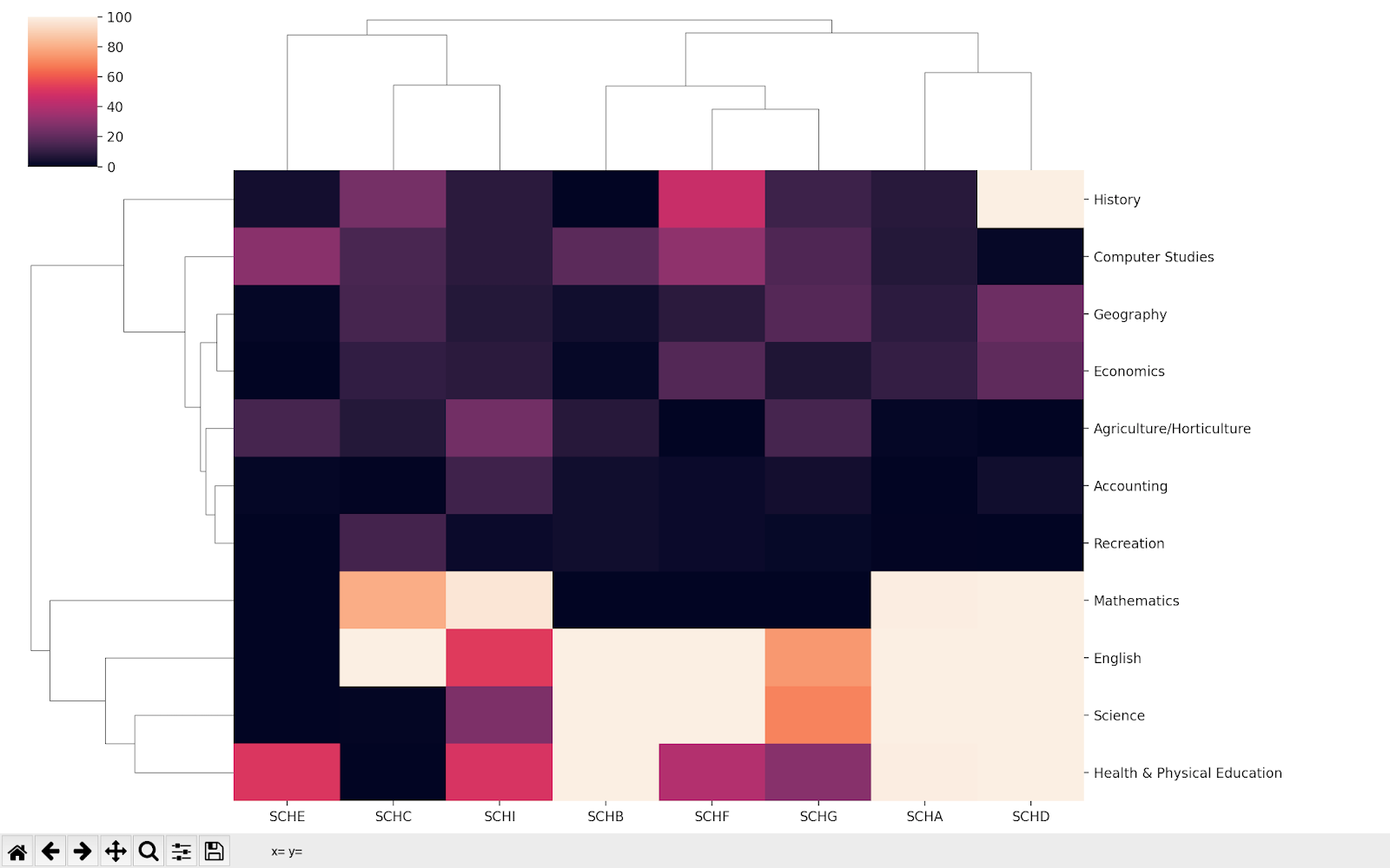
Visual Analysis

Image 9.
Let us scrap the observation from the above Learning Curve Dendrogram (Image 9).
- Two clusters of students are divided based on subject preference. In the diagram’s first cluster (A), students prefer English, Science, Health & Physical Education. The second cluster (B) of the graph shows that students prefer other subjects such as Mathematics, history, etc.
- Mathematics is the most chosen subject.
- Analyzing the first cluster(A), we see students prefer English more than other subjects. Likewise, in the second Custer(B), the students choose Geography, Economics, Accounting and Recreation subjects least.
- Students prefer History subject more than subject geography, economics and so on.
The dendrogram helps us to derive these observations with ease. And researcher can use this information along with other surveyed data to create a curriculum for schools in New Zealand.
Summary
The data are grouped based on a similarity called a cluster. With the cluster of data, you can’t scrap information with ease.
The best tool to visualize clusters is through Dendrogram diagrams. This tool connects the data into smaller groups than smaller groups and finally branches out to the larger group. Dendrogram can be created using three Python library Plotly, Scipy and Seaborn.
I hope you have got all the answers that surround your mind. Try it out and give me your precious comments to thoufeeq87.mtr (at) gmail.com.