Matplotlib with Python is the most powerful combination in the area of data visualization and data science.
This guide takes 25 minutes of your time—if you watch the videos, it’ll take you 2-4 hours. But it will be a great investment of your time because it’ll make you a better coder and more effective data scientist.
Let’s have a look at the following plots—you’ll learn how to generate each of them in this full guide into the Matplotlib library.

Beautiful isn’t it?
Or how do you like this one:
It looks very sophisticated—but it is simple as you’ll see in the following Matplotlib course. But first things first—let’s start with the humble line plot!
Matplotlib Line Plot
The line plot is the most iconic of all the plots.
To draw one in matplotlib, use the plt.plot() function and pass it a list of numbers used as the y-axis values.
Per default, the x-axis values are the list indexes of the passed line. Matplotlib automatically connects the points with a blue line per default. You can change the line type and marker size with additional arguments.
Syntax of plt.plot():
plot([x], y, [fmt], *, data=None, **kwargs)

Example Calls:
>>> plot(x, y)        # plot x and y using default line style and color
>>> plot(x, y, 'bo')  # plot x and y using blue circle markers
>>> plot(y)           # plot y using x as index array 0..N-1
>>> plot(y, 'r+')     # ditto, but with red plusses
The minimal example is the following:
import matplotlib.pyplot as plt
plt.plot([0, 1, 2, 3])
plt.ylabel('line plot')
plt.show()
The output generated by these four lines of code is the following simple line plot:

Read More in Our Full Finxter Tutorial: Matplotlib Line Plot – A Helpful Illustrated Guide
Matplotlib Scatter Plot
Scatter plots are a key tool in any Data Analyst’s arsenal. If you want to see the relationship between two variables, you are usually going to make a scatter plot.
The following code shows a minimal example of creating a scatter plot in Python.
import matplotlib.pyplot as plt

x = [0, 1, 2, 3, 4, 5]
y = [1, 2, 4, 8, 16, 32]

plt.plot(x, y, 'o')
plt.show()
You perform the following steps:
- Import the matplotlib module.
- Create the data for the
(x,y)points. - Plot the data using the
plt.plot()function. The first argument is the iterable ofxvalues. The second argument is the iterable ofyvalues. The third argument is the style of the scatter points.
Here’s how the result looks like:

Read More in Our Full Finxter Tutorial: Matplotlib Scatter Plot – Simple Illustrated Guide
Matplotlib Legend
You’ve plotted some data in Matplotlib but you don’t know which data shows what? It’s time for a legend!
How to add a legend in Python’s Matplotlib library?
- Label it with the
labelkeyword argument in your plot method. - Before
plt.show(), callplt.legend()your plot will be displayed with a legend.
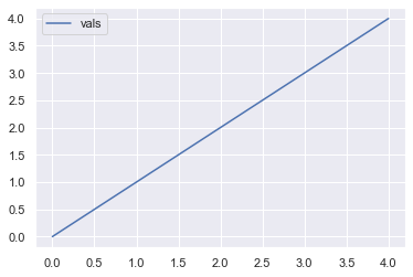
Here’s the minimal example:
# Import necessary modules
import matplotlib.pyplot as plt
import numpy as np

# Optional: Use seaborn style as it looks nicer than matplotlib's default
import seaborn as sns; sns.set()

# Generate data
vals = np.array([0, 1, 2, 3, 4])

# Plot and label
plt.plot(vals, label='vals')

plt.legend()
plt.show()
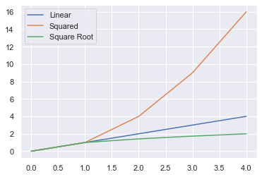
If you plot and label multiple lines, the legend will contain multiple entries.
plt.plot(vals, label='Linear')
plt.plot(vals**2, label='Squared')
plt.plot(vals**0.5, label='Square Root')

plt.legend()
plt.show()
Read More in Our Full Finxter Tutorial: Matplotlib Legend – A Helpful Illustrated Guide
Matplotlib Histogram
First, we need some data.
I went to this site to find out the mean height and standard deviation of US females. It is common knowledge that height is normally distributed. So I used Python’s random module to create 10,000 samples
import random

# data obtained online
mean = 162
std = 7.1

# set seed so we can reproduce our results
random.seed(1)

# use list comprehension to generate 10,000 samples
us_female_heights = [random.normalvariate(mean, std) for i in range(10000)]
Optional step: Seaborn’s default plots look better than matplotlib’s, so let’s use them.
import seaborn as sns

sns.set()
The most basic histogram in in matplotlib.pyplot is really easy to do
import matplotlib.pyplot as plt

plt.hist(us_female_heights)
plt.show()
Not bad for basic settings. The general shape is clear. We see that most of the data is concentrated in the middle – 155cm-170cm. We can also see the frequency counts.
Because we know our data, we know that the x-axis is height in cm and the y-axis is frequency. But you must always label your axes. Other people don’t know what this graph is showing. Adding labels makes this clear. Write these three lines of code to give the plot a title and axis labels.
plt.hist(us_female_heights)
plt.title('Height of 10,000 US Females')
plt.xlabel('Height (cm)')
plt.ylabel('Frequency')
plt.show()
Read More in Our Full Finxter Tutorial: Matplotlib Histogram — A Simple Illustrated Guide
Matplotlib 3D Plot
In addition to import matplotlib.pyplot as plt and calling plt.show(), to create a 3D plot in matplotlib, you need to:
- Import the
Axes3Dobject - Initialize your
FigureandAxes3Dobjects - Get some 3D data
- Plot it using
Axesnotation and standard function calls
# Standard import
import matplotlib.pyplot as plt

# Import 3D Axes
from mpl_toolkits.mplot3d import axes3d

# Set up Figure and 3D Axes
fig = plt.figure()
ax = fig.add_subplot(111, projection='3d')

# Get some 3D data
X = [0, 1, 2, 3, 4, 5, 6, 7, 8, 9]
Y = [2, 5, 8, 2, 10, 1, 10, 5, 7, 8]
Z = [6, 3, 9, 6, 3, 2, 3, 10, 2, 4]

# Plot using Axes notation and standard function calls
ax.plot(X, Y, Z)
plt.show()
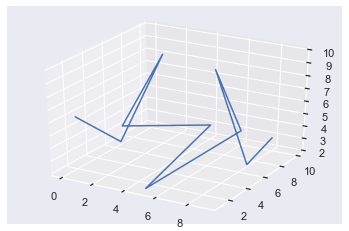
Awesome! You’ve just created your first 3D plot! Don’t worry if that was a bit fast, let’s dive into a more detailed example.
Read More in Our Full Finxter Tutorial: Matplotlib 3D Plot – A Helpful Illustrated Guide
Matplotlib 3D Plot Advanced
The four steps needed to create advanced 3D plots are the same as those needed to create basic ones. If you don’t understand those steps, check out my article on how to make basic 3D plots first.
The most difficult part of creating surface and wireframe plots is step 3: getting 3D data. Matplotlib actually includes a helper function axes3d.get_test_data() to generate some data for you. It accepts a float and, for best results, choose a value between 0 and 1. It always produces the same plot, but different floats give you different sized data and thus impact how detailed the plot is.
However, the best way to learn 3D plotting is to create custom plots.
At the end of step 3, you want to have three numpy arrays X, Y and Z, which you will pass to ax.plot_wireframe() or ax.plot_surface(). You can break step 3 down into four steps:
- Define the x-axis and y-axis limits
- Create a grid of XY-points (to get X and Y)
- Define a z-function
- Apply the z-function to X and Y (to get Z)
In matplotlib, the z-axis is vertical by default. So, the ‘bottom’ of the Axes3D object is a grid of XY points. For surface or wireframe plots, each pair of XY points has a corresponding Z value. So, we can think of surface/wireframe plots as the result of applying some z-function to every XY-pair on the ‘bottom’ of the Axes3D object.
Since there are infinitely many numbers on the XY-plane, it is not possible to map every one to a Z-value. You just need an amount large enough to deceive humans – anything above 50 pairs usually works well.
To create your XY-points, you first need to define the x-axis and y-axis limits. Let’s say you want X-values ranging from -5 to +5 and Y-values from -2 to +2. You can create an array of numbers for each of these using the np.linspace() function. For reasons that will become clear later, I will make x have 100 points, and y have 70.
x = np.linspace(-5, 5, num=100)
y = np.linspace(-2, 2, num=70)
Both x and y are 1D arrays containing num equally spaced floats in the ranges [-5, 5] and [-2, 2] respectively.
Since the XY-plane is a 2D object, you now need to create a rectangular grid of all xy-pairs. To do this, use the numpy function np.meshgrid(). It takes n 1D arrays and turns them into an N-dimensional grid. In this case, it takes two 1D arrays and turns them into a 2D grid.
X, Y = np.meshgrid(x, y)
Now you’ve created X and Y, so let’s inspect them.
print(f'Type of X: {type(X)}')
print(f'Shape of X: {X.shape}\n')
print(f'Type of Y: {type(Y)}')
print(f'Shape of Y: {Y.shape}')
Type of X: <class 'numpy.ndarray'>
Shape of X: (70, 100)

Type of Y: <class 'numpy.ndarray'>
Shape of Y: (70, 100)
Both X and Y are numpy arrays of the same shape: (70, 100). This corresponds to the size of y and x respectively. As you would expect, the size of y dictates the height of the array, i.e., the number of rows and the size of x dictates the width, i.e., the number of columns.
Note that I used lowercase x and y for the 1D arrays and uppercase X and Y for the 2D arrays. This is standard practice when making 3D plots, and I use it throughout the article.
Now you’ve created your grid of points; it’s time to define a function to apply to them all. Since this function outputs z-values, I call it a z-function. Common z-functions contain np.sin() and np.cos() because they create repeating, cyclical patterns that look interesting when plotted in 3D. Additionally, z-functions usually combine both X and Y variables as 3D plots look at how all the variables interact.
# Define z-function with 2 arguments: x and y
def z_func(x, y):
    return np.sin(np.cos(x) + y)

# Apply to X and Y
Z = z_func(X, Y)
Here I defined a z-function that accepts 2 variables – x and y – and is a combination of np.sin() and np.cos() functions. Then I applied it to X and Y to get the Z array. Thanks to numpy broadcasting, python applies the z-function to every XY pair almost instantly and saves you from having to write a wildly inefficient for loop.
Note that Z is the same shape and type as both X and Y.
print(f'Type of Z: {type(Z)}')
print(f'Shape of Z: {Z.shape}')
Type of Z: <class 'numpy.ndarray'>
Shape of Z: (70, 100)
Now that you have got your data, all that is left to do is make the plots. Let’s put all the above code together:
# Set up Figure and 3D Axes
fig = plt.figure()
ax = fig.add_subplot(111, projection='3d')

# Create x and y 1D arrays
x = np.linspace(-5, 5, num=100)
y = np.linspace(-2, 2, num=70)

# Create X and Y 2D arrays
X, Y = np.meshgrid(x, y)

# Define Z-function
def z_func(x, y): return np.sin(np.cos(x) + y)

# Create Z 2D array
Z = z_func(X, Y)

# Plot using Axes notation
ax.plot_wireframe(X, Y, Z)
# Set axes lables
ax.set(xlabel='x', ylabel='y', zlabel='z')
plt.show()
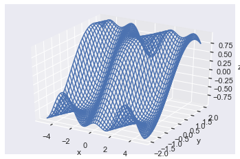
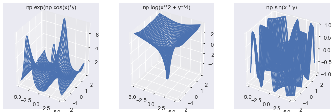
Great, I found the above plot by playing around with different z-functions and think it looks pretty cool! Z-functions containing np.log(), np.exp(), np.sin(), np.cos() and combinations of x and y usually lead to interesting plots – I encourage you to experiment yourself.
Now I’ll create 3 different z-functions with the same X and Y as before and create a subplot of them so you can see the differences.
# Set up Figure and Axes
fig, axes = plt.subplots(1, 3, subplot_kw=dict(projection='3d'),
                        figsize=plt.figaspect(1/3))

# Create 3 z-functions
def z_1(x, y): return np.exp(np.cos(x)*y)
def z_2(x, y): return np.log(x**2 + y**4)
def z_3(x, y): return np.sin(x * y)

# Create 3 Z arrays
Z_arrays = [z_1(X, Y), z_2(X, Y), z_3(X, Y)]
# Titles for the plots
z_func_names = ['np.exp(np.cos(x)*y)', 'np.log(x**2 + y**4)', 'np.sin(x * y)']

# Plot all 3 wireframes
for Z_array, z_name, ax in zip(Z_arrays, z_func_names, axes):
    ax.plot_wireframe(X, Y, Z_array)
    ax.set(title=z_name)
plt.show()

I think all of these images demonstrate the power of 3D plotting, and I hope they have encouraged you to create your own.
Now you know how to create any surface or wireframe plot with your data. But so far, you have only used the default settings. Let’s modify them using the available keyword arguments.
Read More in Our Full Finxter Tutorial: Matplotlib 3D Plot Advanced
Matplotlib Animation
Here’s the full code:
# Standard imports
import numpy as np
import matplotlib.pyplot as plt
from matplotlib.animation import FuncAnimation

# Set up empty Figure, Axes and Line objects
fig, ax = plt.subplots()
# Set axes limits so that the whole image is included
ax.set(xlim=(-0.1, 2*np.pi+0.1), ylim=(-1.1, 1.1))
# Draw a blank line
line, = ax.plot([], [])

# Define data - one sine wave
x = np.linspace(0, 2*np.pi, num=50)
y = np.sin(x)

# Define animate function
def animate(i):
    line.set_data(x[:i], y[:i])
    return line,

# Pass to FuncAnimation
anim = FuncAnimation(fig, animate, frames=len(x)+1, interval=30, blit=True)

# Save in the current working directory
anim.save('sin.mp4')
Read More in Our Full Finxter Tutorial: Matplotlib Animation – A Helpful Illustrated Guide
Matplotlib Widgets — Creating Interactive Plots with Sliders
This section describes how to generate interactive plots by using the .widgets package from the matplotlib library. As can be inferred from the name, the .widgets package allows creating different types of interactive buttons, which can be used for modifying what is displayed in a matplotlib graph.
In particular, this article will focus on the creation of a Slider button that will be then used for changing the type of Spline curve interpolating the original plot. In this way, it will be possible to evaluate in real time, the effect of changing some of the spline parameters on the fit.
But let’s start with the end in mind: here’s the code you’re going to explore and the resulting plot:
import numpy as np
from scipy.interpolate import UnivariateSpline
import matplotlib.pyplot as plt
from matplotlib.widgets import Slider

# Initial x and y arrays
x = np.linspace(0, 10, 30)
y = np.sin(0.5*x)*np.sin(x*np.random.randn(30))

# Spline interpolation
spline = UnivariateSpline(x, y, s = 6)
x_spline = np.linspace(0, 10, 1000)
y_spline = spline(x_spline)

# Plotting
fig = plt.figure()
plt.subplots_adjust(bottom=0.25)
ax = fig.subplots()
p = ax.plot(x,y)
p, = ax.plot(x_spline, y_spline, 'g')

# Defining the Slider button
# xposition, yposition, width and height
ax_slide = plt.axes([0.25, 0.1, 0.65, 0.03])

# Properties of the slider
s_factor = Slider(ax_slide, 'Smoothing factor',
                  0.1, 6, valinit=6, valstep=0.2)

# Updating the plot
def update(val):
    current_v = s_factor.val
    spline = UnivariateSpline(x, y, s = current_v)
    p.set_ydata(spline(x_spline))
    #redrawing the figure
    fig.canvas.draw()

# Calling the function "update" when the value of the slider is changed
s_factor.on_changed(update)
plt.show()
The output is an interactive Python plot window that allows you to control the graph with a slider:

Read More in Our Full Finxter Tutorial: Matplotlib Widgets — Creating Interactive Plots with Sliders
Creating Beautiful Heatmaps with Seaborn
Heatmaps are a specific type of plot which exploits the combination of color schemes and numerical values for representing complex and articulated datasets. They are largely used in data science application that involves large numbers, like biology, economics and medicine.
In this video we will see how to create a heatmap for representing the total number of COVID-19 cases in the different USA countries, in different days. For achieving this result, we will exploit Seaborn, a Python package that provides lots of fancy and powerful functions for plotting data.
Here’s the code to be discussed:
import numpy as np
import pandas as pd
import matplotlib.pyplot as plt
import seaborn as sns

#url of the .csv file
url = r"path of the .csv file"

# import the .csv file into a pandas DataFrame
df = pd.read_csv(url, sep = ';', thousands = ',')

# defining the array containing the states present in the study
states = np.array(df['state'].drop_duplicates())[:40]

#extracting the total cases for each day and each country
overall_cases = []
for state in states:
    tot_cases = []
    for i in range(len(df['state'])):
        if df['state'][i] == state:
            tot_cases.append(df['tot_cases'][i])
    overall_cases.append(tot_cases[:30])

data = pd.DataFrame(overall_cases).T
data.columns = states

#Plotting
fig = plt.figure()
ax = fig.subplots()
ax = sns.heatmap(data, annot = True, fmt="d", linewidths=0, cmap = 'viridis', xticklabels = True)
ax.invert_yaxis()
ax.set_xlabel('States')
ax.set_ylabel('Day n°')
plt.show()

Read More in Our Full Finxter Tutorial: Creating Beautiful Heatmaps with Seaborn
Where to Go From Here?
Enough theory. Let’s get some practice!
Coders get paid six figures and more because they can solve problems more effectively using machine intelligence and automation.
To become more successful in coding, solve more real problems for real people. That’s how you polish the skills you really need in practice. After all, what’s the use of learning theory that nobody ever needs?
You build high-value coding skills by working on practical coding projects!
Do you want to stop learning with toy projects and focus on practical code projects that earn you money and solve real problems for people?
🚀 If your answer is YES!, consider becoming a Python freelance developer! It’s the best way of approaching the task of improving your Python skills—even if you are a complete beginner.
If you just want to learn about the freelancing opportunity, feel free to watch my free webinar “How to Build Your High-Income Skill Python” and learn how I grew my coding business online and how you can, too—from the comfort of your own home.
Also, feel free to check our tutorial on plotting logarithmic axes on BTC data—it’s fun! 🙂
👉 Recommended Tutorial: Python Plot Logarithmic Axes (Bitcoin Example)
