
Too much stuff happening in a single plot? No problem—use multiple subplots!
This in-depth tutorial shows you everything you need to know to get started with Matplotlib’s subplots() function.
If you want, just hit “play” and watch the explainer video. I’ll then guide you through the tutorial:
Let’s start with the short answer on how to use it—you’ll learn all the details later!
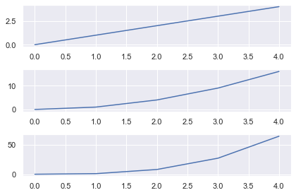
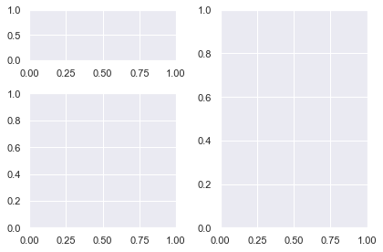
The plt.subplots() function creates a Figure and a Numpy array of Subplot/Axes objects which you store in fig and axes respectively.
Specify the number of rows and columns you want with the nrows and ncols arguments.
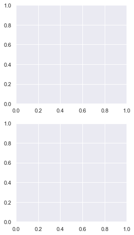
fig, axes = plt.subplots(nrows=3, ncols=1)
This creates a Figure and Subplots in a 3×1 grid. The Numpy array axes has shape (nrows, ncols) the same shape as the grid, in this case (3,) (it’s a 1D array since one of nrows or ncols is 1). Access each Subplot using Numpy slice notation and call the plot() method to plot a line graph.
Once all Subplots have been plotted, call plt.tight_layout() to ensure no parts of the plots overlap. Finally, call plt.show() to display your plot.
# Import necessary modules and (optionally) set Seaborn style
import matplotlib.pyplot as plt
import seaborn as sns; sns.set()
import numpy as np

# Generate data to plot
linear = [x for x in range(5)]
square = [x**2 for x in range(5)]
cube = [x**3 for x in range(5)]

# Generate Figure object and Axes object with shape 3x1
fig, axes = plt.subplots(nrows=3, ncols=1)

# Access first Subplot and plot linear numbers
axes[0].plot(linear)

# Access second Subplot and plot square numbers
axes[1].plot(square)

# Access third Subplot and plot cube numbers
axes[2].plot(cube)

plt.tight_layout()
plt.show()
Matplotlib Figures and Axes
Up until now, you have probably made all your plots with the functions in matplotlib.pyplot i.e. all the functions that start with plt..
These work nicely when you draw one plot at a time. But to draw multiple plots on one Figure, you need to learn the underlying classes in matplotlib.
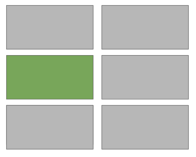
Let’s look at an image that explains the main classes from the AnatomyOfMatplotlib tutorial:

To quote AnatomyOfMatplotlib:
The
Figureis the top-level container in this hierarchy. It is the overall window/page that everything is drawn on. You can have multiple independent figures andFigures can contain multipleAxes.Most plotting ocurs on an
Axes. The axes is effectively the area that we plot data on and any ticks/labels/etc associated with it. Usually we’ll set up an Axes with a call tosubplots(which places Axes on a regular grid), so in most cases,AxesandSubplotare synonymous.Each
Axeshas anXAxisand aYAxis. These contain the ticks, tick locations, labels, etc. In this tutorial, we’ll mostly control ticks, tick labels, and data limits through other mechanisms, so we won’t touch the individualAxispart of things all that much. However, it is worth mentioning here to explain where the termAxescomes from.
The typical variable names for each object are:
Figure–figorf,Axes(plural) –axesoraxs,Axes(singular) –axora
The word Axes refers to the area you plot on and is synonymous with Subplot. However, you can have multiple Axes (Subplots) on a Figure. In speech and writing use the same word for the singular and plural form. In your code, you should make a distinction between each – you plot on a singular Axes but will store all the Axes in a Numpy array.
An Axis refers to the XAxis or YAxis – the part that gets ticks and labels.
The pyplot module implicitly works on one Figure and one Axes at a time. When we work with Subplots, we work with multiple Axes on one Figure. So, it makes sense to plot with respect to the Axes and it is much easier to keep track of everything.
The main differences between using Axes methods and pyplot are:
- Always create a
FigureandAxesobjects on the first line - To plot, write
ax.plot()instead ofplt.plot().
Once you get the hang of this, you won’t want to go back to using pyplot. It’s much easier to create interesting and engaging plots this way. In fact, this is why most StackOverflow answers are written with this syntax.
All of the functions in pyplot have a corresponding method that you can call on Axes objects, so you don’t have to learn any new functions.
Let’s get to it.
Matplotlib Subplots Example
The plt.subplots() function creates a Figure and a Numpy array of Subplots/Axes objects which we store in fig and axes respectively.
Specify the number of rows and columns you want with the nrows and ncols arguments.
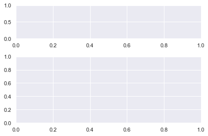
fig, axes = plt.subplots(nrows=3, ncols=1)
This creates a Figure and Subplots in a 3×1 grid. The Numpy array axes is the same shape as the grid, in this case (3,). Access each Subplot using Numpy slice notation and call the plot() method to plot a line graph.
Once all Subplots have been plotted, call plt.tight_layout() to ensure no parts of the plots overlap. Finally, call plt.show() to display your plot.
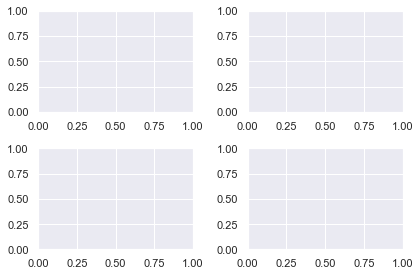
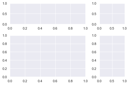
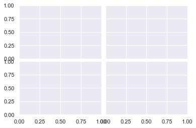
fig, axes = plt.subplots(nrows=2, ncols=2)

plt.tight_layout()
plt.show()
The most important arguments for plt.subplots() are similar to the matplotlib subplot function but can be specified with keywords. Plus, there are more powerful ones which we will discuss later.
To create a Figure with one Axes object, call it without any arguments
fig, ax = plt.subplots()
Note: this is implicitly called whenever you use the pyplot module. All ‘normal’ plots contain one Figure and one Axes.
In advanced blog posts and StackOverflow answers, you will see a line similar to this at the top of the code. It is much more Pythonic to create your plots with respect to a Figure and Axes.
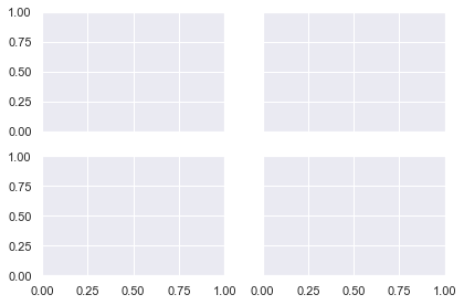
To create a Grid of subplots, specify nrows and ncols – the number of rows and columns respectively
fig, axes = plt.subplots(nrows=2, ncols=2)
The variable axes is a numpy array with shape (nrows, ncols). Note that it is in the plural form to indicate it contains more than one Axes object. Another common name is axs. Choose whichever you prefer. If you call plt.subplots() without an argument name the variable ax as there is only one Axes object returned.
I will select each Axes object with slicing notation and plot using the appropriate methods. Since I am using Numpy slicing, the index of the first Axes is 0, not 1.
# Create Figure and 2x2 gris of Axes objects
fig, axes = plt.subplots(nrows=2, ncols=2)

# Generate data to plot.
data = np.array([1, 2, 3, 4, 5])

# Access Axes object with Numpy slicing then plot different distributions
axes[0, 0].plot(data)
axes[0, 1].plot(data**2)
axes[1, 0].plot(data**3)
axes[1, 1].plot(np.log(data))

plt.tight_layout()
plt.show()

First I import the necessary modules, then create the Figure and Axes objects using plt.subplots(). The Axes object is a Numpy array with shape (2, 2) and I access each subplot via Numpy slicing before doing a line plot of the data. Then, I call plt.tight_layout() to ensure the axis labels don’t overlap with the plots themselves. Finally, I call plt.show() as you do at the end of all matplotlib plots.
🌍 Recommended Tutorial: How to Return a Plot or Figure in Python Matplotlib?
Matplotlib Subplots Title
To add an overall title to the Figure, use plt.suptitle().
To add a title to each Axes, you have two methods to choose from:
ax.set_title('bar')ax.set(title='bar')
In general, you can set anything you want on an Axes using either of these methods. I recommend using ax.set() because you can pass any setter function to it as a keyword argument. This is faster to type, takes up fewer lines of code and is easier to read.
Let’s set the title, xlabel and ylabel for two Subplots using both methods for comparison
# Unpack the Axes object in one line instead of using slice notation
fig, (ax1, ax2) = plt.subplots(nrows=1, ncols=2)

# First plot - 3 lines
ax1.set_title('many')
ax1.set_xlabel('lines')
ax1.set_ylabel('of code')

# Second plot - 1 line
ax2.set(title='one', xlabel='line', ylabel='of code')

# Overall title
plt.suptitle('My Lovely Plot')
plt.tight_layout()
plt.show()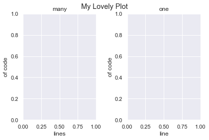
Clearly using ax.set() is the better choice.
Note that I unpacked the Axes object into individual variables on the first line. You can do this instead of Numpy slicing if you prefer. It is easy to do with 1D arrays. Once you create grids with multiple rows and columns, it’s easier to read if you don’t unpack them.
Matplotlib Subplots Share X Axis
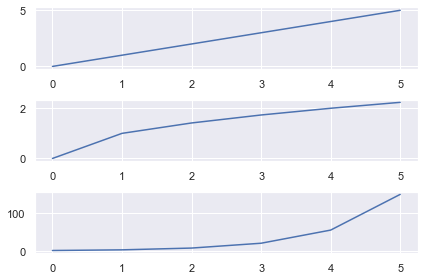
To share the x axis for subplots in matplotlib, set sharex=True in your plt.subplots() call.
# Generate data
data = [0, 1, 2, 3, 4, 5]

# 3x1 grid that shares the x axis
fig, axes = plt.subplots(nrows=3, ncols=1, sharex=True)

# 3 different plots
axes[0].plot(data)
axes[1].plot(np.sqrt(data))
axes[2].plot(np.exp(data))

plt.tight_layout()
plt.show()
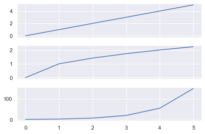
Here I created 3 line plots that show the linear, square root and exponential of the numbers 0-5.
As I used the same numbers, it makes sense to share the x-axis.
Here I wrote the same code but set sharex=False (the default behavior). Now there are unnecessary axis labels on the top 2 plots.
You can also share the y axis for plots by setting sharey=True in your plt.subplots() call.
Matplotlib Subplots Legend
To add a legend to each Axes, you must
- Label it using the
labelkeyword - Call
ax.legend()on theAxesyou want the legend to appear
Let’s look at the same plot as above but add a legend to each Axes.
# Generate data, 3x1 plot with shared XAxis
data = [0, 1, 2, 3, 4, 5]
fig, axes = plt.subplots(nrows=3, ncols=1, sharex=True)

# Plot the distributions and label each Axes
axes[0].plot(data, label='Linear')
axes[1].plot(np.sqrt(data), label='Square Root')
axes[2].plot(np.exp(data), label='Exponential')

# Add a legend to each Axes with default values
for ax in axes:
    ax.legend()

plt.tight_layout()
plt.show()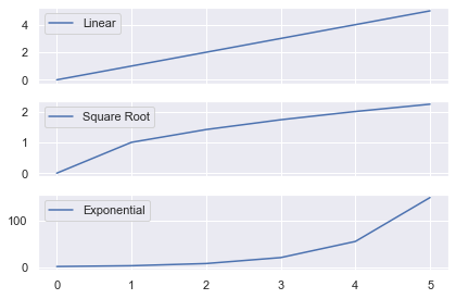
The legend now tells you which function has been applied to the data. I used a for loop to call ax.legend() on each of the Axes. I could have done it manually instead by writing:
axes[0].legend()
axes[1].legend()
axes[2].legend()
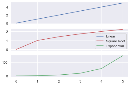
Instead of having 3 legends, let’s just add one legend to the Figure that describes each line. Note that you need to change the color of each line, otherwise the legend will show three blue lines.
The matplotlib legend function takes 2 arguments
ax.legend(handles, labels)
handles– the lines/plots you want to add to the legend (list)labels– the labels you want to give each line (list)
Get the handles by storing the output of you ax.plot() calls in a list. You need to create the list of labels yourself. Then call legend() on the Axes you want to add the legend to.
# Generate data and 3x1 grid with a shared x axis
data = [0, 1, 2, 3, 4, 5]
fig, axes = plt.subplots(nrows=3, ncols=1, sharex=True)

# Store the output of our plot calls to use as handles
# Plot returns a list of length 1, so unpack it using a comma
linear, = axes[0].plot(data, 'b')
sqrt, = axes[1].plot(np.sqrt(data), 'r')
exp, = axes[2].plot(np.exp(data), 'g')

# Create handles and labels for the legend
handles = [linear, sqrt, exp]
labels = ['Linear', 'Square Root', 'Exponential']

# Draw legend on first Axes
axes[0].legend(handles, labels)

plt.tight_layout()
plt.show()

First I generated the data and a 3×1 grid. Then I made three ax.plot() calls and applied different functions to the data.
Note that ax.plot() returns a list of matplotlib.line.Line2D objects. You have to pass these Line2D objects to ax.legend() and so need to unpack them first.
Standard unpacking syntax in Python is:
a, b = [1, 2]
# a = 1, b = 2
However, each ax.plot() call returns a list of length 1. To unpack these lists, write
x, = [5]
# x = 5
If you just wrote x = [5] then x would be a list and not the object inside the list.
After the plot() calls, I created 2 lists of handles and labels which I passed to axes[0].legend() to draw it on the first plot.
In the above plot, I changed thelegend call to axes[1].legend(handles, labels) to plot it on the second (middle) Axes.
Matplotlib Subplots Size
You have total control over the size of subplots in matplotlib.
You can either change the size of the entire Figure or the size of the Subplots themselves.
First, let’s look at changing the Figure.
Matplotlib Figure Size
If you are happy with the size of your subplots but you want the final image to be larger/smaller, change the Figure.
If you’ve read my article on the matplotlib subplot function, you know to use the plt.figure() function to to change the Figure. Fortunately, any arguments passed to plt.subplots() are also passed to plt.figure(). So, you don’t have to add any extra lines of code, just keyword arguments.
Let’s change the size of the Figure.
# Create 2x1 grid - 3 inches wide, 6 inches long
fig, axes = plt.subplots(nrows=2, ncols=1, figsize=(3, 6))
plt.show()
I created a 2×1 plot and set the Figure size with the figsize argument. It accepts a tuple of 2 numbers – the (width, height) of the image in inches.
So, I created a plot 3 inches wide and 6 inches long – figsize=(3, 6).
# 2x1 grid - twice as long as it is wide
fig, axes = plt.subplots(nrows=2, ncols=1, figsize=plt.figaspect(2))
plt.show()
You can set a more general Figure size with the matplotlib figaspect function. It lets you set the aspect ratio (height/width) of the Figure.
Above, I created a Figure twice as long as it is wide by setting figsize=plt.figaspect(2).
Note: Remember the aspect ratio (height/width) formula by recalling that height comes first in the alphabet before width.
Matplotlib Subplots Different Sizes
If you have used plt.subplot() before (I’ve written a whole tutorial on this too), you’ll know that the grids you create are limited. Each Subplot must be part of a regular grid i.e. of the form 1/x for some integer x. If you create a 2×1 grid, you have 2 rows and each row takes up 1/2 of the space. If you create a 3×2 grid, you have 6 subplots and each takes up 1/6 of the space.
Using plt.subplots() you can create a 2×1 plot with 2 rows that take up any fraction of space you want.
Let’s make a 2×1 plot where the top row takes up 1/3 of the space and the bottom takes up 2/3.
You do this by specifying the gridspec_kw argument and passing a dictionary of values. The main arguments we are interested in are width_ratios and height_ratios. They accept lists that specify the width ratios of columns and height ratios of the rows. In this example the top row is 1/3 of the Figure and the bottom is 2/3. Thus the height ratio is 1:2 or [1, 2] as a list.
# 2 x1 grid where top is 1/3 the size and bottom is 2/3 the size
fig, axes = plt.subplots(nrows=2, ncols=1,
                         gridspec_kw={'height_ratios': [1, 2]})

plt.tight_layout()
plt.show()
The only difference between this and a regular 2×1 plt.subplots() call is the gridspec_kw argument. It accepts a dictionary of values. These are passed to the matplotlib GridSpec constructor (the underlying class that creates the grid).
Let’s create a 2×2 plot with the same [1, 2] height ratios but let’s make the left hand column take up 3/4 of the space.
# Heights: Top row is 1/3, bottom is 2/3 --> [1, 2]
# Widths : Left column is 3/4, right is 1/4 --> [3, 1]
ratios = {'height_ratios': [1, 2],
          'width_ratios': [3, 1]}

fig, axes = plt.subplots(nrows=2, ncols=2, gridspec_kw=ratios)

plt.tight_layout()
plt.show()
Everything is the same as the previous plot but now we have a 2×2 grid and have specified width_ratios. Since the left column takes up 3/4 of the space and the right takes up 1/4 the ratios are [3, 1].
Matplotlib Subplots Size
In the previous examples, there were white lines that cross over each other to separate the Subplots into a clear grid. But sometimes you will not have that to guide you. To create a more complex plot, you have to manually add Subplots to the grid.
You could do this using the plt.subplot() function. But since we are focusing on Figure and Axes notation in this article, I’ll show you how to do it another way.
You need to use the fig.add_subplot() method and it has the same notation as plt.subplot(). Since it is a Figure method, you first need to create one with the plt.figure() function.
fig = plt.figure()
<Figure size 432x288 with 0 Axes>
The hardest part of creating a Figure with different sized Subplots in matplotlib is figuring out what fraction of space each Subplot takes up.
So, it’s a good idea to know what you are aiming for before you start. You could sketch it on paper or draw shapes in PowerPoint. Once you’ve done this, everything else is much easier.
I’m going to create this shape.

I’ve labeled the fraction each Subplot takes up as we need this for our fig.add_subplot() calls.
I’ll create the biggest Subplot first and the others in descending order.
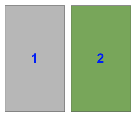
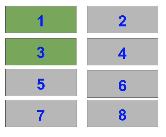
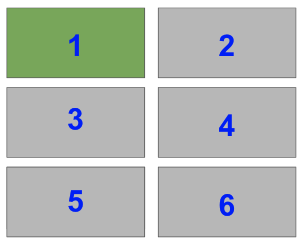
The right hand side is half of the plot. It is one of two plots on a Figure with 1 row and 2 columns. To select it with fig.add_subplot(), you need to set index=2.
Remember that indexing starts from 1 for the functions plt.subplot() and fig.add_subplot().
In the image, the blue numbers are the index values each Subplot has.
ax1 = fig.add_subplot(122)
As you are working with Axes objects, you need to store the result of fig.add_subplot() so that you can plot on it afterwards.

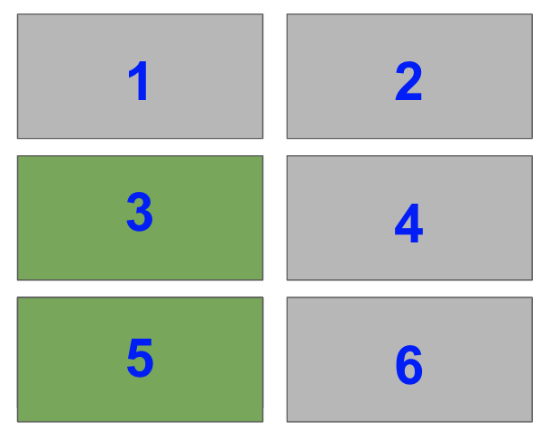
Now, select the bottom left Subplot in a a 2×2 grid i.e. index=3
ax2 = fig.add_subplot(223)
Lastly, select the top two Subplots on the left hand side of a 4×2 grid i.e. index=1 and index=3.
ax3 = fig.add_subplot(423)
ax4 = fig.add_subplot(421)
When you put this altogether you get
# Initialise Figure
fig = plt.figure()

# Add 4 Axes objects of the size we want
ax1 = fig.add_subplot(122)
ax2 = fig.add_subplot(223)
ax3 = fig.add_subplot(423)
ax4 = fig.add_subplot(421)

plt.tight_layout(pad=0.1)
plt.show()
Perfect! Breaking the Subplots down into their individual parts and knowing the shape you want, makes everything easier.
Now, let’s do something you can’t do with plt.subplot(). Let’s have 2 plots on the left hand side with the bottom plot twice the height as the top plot.

Like with the above plot, the right hand side is half of a plot with 1 row and 2 columns. It is index=2.
So, the first two lines are the same as the previous plot
fig = plt.figure()
ax1 = fig.add_subplot(122)
The top left takes up 1/3 of the space of the left-hand half of the plot. Thus, it takes up 1/3 x 1/2 = 1/6 of the total plot. So, it is index=1 of a 3×2 grid.
ax2 = fig.add_subplot(321)
The final subplot takes up 2/3 of the remaining space i.e. index=3 and index=5 of a 3×2 grid. But you can’t add both of these indexes as that would add two Subplots to the Figure. You need a way to add one Subplot that spans two rows.
You need the matplotlib subplot2grid function – plt.subplot2grid(). It returns an Axes object and adds it to the current Figure.
Here are the most important arguments:
ax = plt.subplot2grid(shape, loc, rowspan, colspan)
shape– tuple of 2 integers – the shape of the overall grid e.g. (3, 2) has 3 rows and 2 columns.loc– tuple of 2 integers – the location to place theSubplotin the grid. It uses 0-based indexing so (0, 0) is first row, first column and (1, 2) is second row, third column.rowspan– integer, default 1- number of rows for theSubplotto span to the rightcolspan– integer, default 1 – number of columns for theSubplotto span down
From those definitions, you need to select the middle left Subplot and set rowspan=2 so that it spans down 2 rows.

Thus, the arguments you need for subplot2grid are:
shape=(3, 2)– 3×2 gridloc=(1, 0)– second row, first colunn (0-based indexing)rowspan=2– span down 2 rows
This gives
ax3 = plt.subplot2grid(shape=(3, 2), loc=(1, 0), rowspan=2)
Sidenote: why matplotlib chose 0-based indexing for loc when everything else uses 1-based indexing is a mystery to me. One way to remember it is that loc is similar to locating. This is like slicing Numpy arrays which use 0-indexing. Also, if you use GridSpec, you will often use Numpy slicing to choose the number of rows and columns that Axes span.
Putting this together, you get
fig = plt.figure()

ax1 = fig.add_subplot(122)
ax2 = fig.add_subplot(321)
ax3 = plt.subplot2grid(shape=(3, 2), loc=(1, 0), rowspan=2)

plt.tight_layout()
plt.show()
Matplotlib Subplots_Adjust
If you aren’t happy with the spacing between plots that plt.tight_layout() provides, manually adjust the spacing with the matplotlib subplots_adjust function.
It takes 6 optional, self explanatory arguments. Each is a float in the range [0.0, 1.0] and is a fraction of the font size:
left,right,bottomandtopis the spacing on each side of theSuplotswspace– the width betweenSubplotshspace– the height betweenSubplots
Let’s compare tight_layout with subplots_adjust.
fig, axes = plt.subplots(nrows=2, ncols=2, sharex=<strong>True</strong>, sharey=<strong>True</strong>)

plt.tight_layout()
plt.show()
Here is a 2×2 grid with plt.tight_layout(). I’ve set sharex and sharey to True to remove unnecessary axis labels.
fig, axes = plt.subplots(nrows=2, ncols=2, sharex=<strong>True</strong>, sharey=<strong>True</strong>)

plt.subplots_adjust(wspace=0.05, hspace=0.05)
plt.show()
Now I’ve decreased the height and width between Subplots to 0.05 and there is hardly any space between them.
To avoid loads of similar examples, I recommend you play around with the arguments to get a feel for how this function works.
Matplotlib Subplots Colorbar
Adding a colorbar to each Axes is similar to adding a legend. You store the ax.plot() call in a variable and pass it to fig.colorbar().
Colorbars are Figure methods since they are placed on the Figure itself and not the Axes. Yet, they do take up space from the Axes they are placed on.
Let’s look at an example.
# Generate two 10x10 arrays of random numbers in the range [0.0, 1.0]
data1 = np.random.random((10, 10))
data2 = np.random.random((10, 10))

# Initialise Figure and Axes objects with 1 row and 2 columns
# Constrained_layout=True is better than plt.tight_layout()
# Make twice as wide as it is long with figaspect
fig, axes = plt.subplots(nrows=1, ncols=2, constrained_layout=True,
                        figsize=plt.figaspect(1/2))

pcm1 = axes[0].pcolormesh(data1, cmap='Blues')
# Place first colorbar on first column - index 0
fig.colorbar(pcm1, ax=axes[0])

pcm2 = axes[1].pcolormesh(data2, cmap='Greens')
# Place second colorbar on second column - index 1
fig.colorbar(pcm2, ax=axes[1])

plt.show()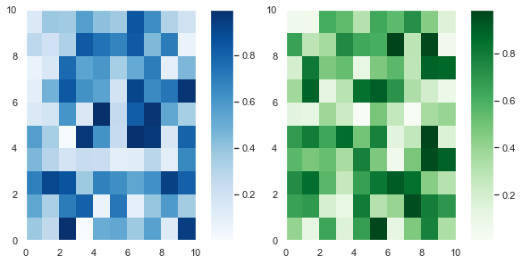
First, I generated two 10×10 arrays of random numbers in the range [0.0, 1.0] using the np.random.random() function. Then I initialized the 1×2 grid with plt.subplots().
The keyword argument constrained_layout=True achieves a similar result to calling plt.tight_layout(). However, tight_layout only checks for tick labels, axis labels and titles. Thus, it ignores colorbars and legends and often produces bad looking plots. Fortunately, constrained_layout takes colorbars and legends into account. Thus, it should be your go-to when automatically adjusting these types of plots.
Finally, I set figsize=plt.figaspect(1/2) to ensure the plots aren’t too squashed together.
After that, I plotted the first heatmap, colored it blue and saved it in the variable pcm1. I passed that to fig.colorbar() and placed it on the first column – axes[0] with the ax keyword argument. It’s a similar story for the second heatmap.
The more Axes you have, the fancier you can be with placing colorbars in matplotlib. Now, let’s look at a 2×2 example with 4 Subplots but only 2 colorbars.
# Set seed to reproduce results
np.random.seed(1)

# Generate 4 samples of the same data set using a list comprehension
# and assignment unpacking
data1, data2, data3, data4 = [np.random.random((10, 10)) for _ in range(4)]

# 2x2 grid with constrained layout
fig, axes = plt.subplots(nrows=2, ncols=2, constrained_layout=True)

# First column heatmaps with same colormap
pcm1 = axes[0, 0].pcolormesh(data1, cmap='Blues')
pcm2 = axes[1, 0].pcolormesh(data2, cmap='Blues')

# First column colorbar - slicing selects all rows, first column
fig.colorbar(pcm1, ax=axes[:, 0])

# Second column heatmaps with same colormap
pcm3 = axes[0, 1].pcolormesh(data3+1, cmap='Greens')
pcm4 = axes[1, 1].pcolormesh(data4+1, cmap='Greens')

# Second column colorbar - slicing selects all rows, second column
# Half the size of the first colorbar
fig.colorbar(pcm3, ax=axes[:, 1], shrink=0.5)

plt.show()

If you pass a list of Axes to ax, matplotlib places the colorbar along those Axes. Moreover, you can specify where the colorbar is with the location keyword argument. It accepts the strings 'bottom', 'left', 'right', 'top' or 'center'.
The code is similar to the 1×2 plot I made above. First, I set the seed to 1 so that you can reproduce the results – you will soon plot this again with the colorbars in different places.
I used a list comprehension to generate 4 samples of the same dataset. Then I created a 2×2 grid with plt.subplots() and set constrained_layout=True to ensure nothing overlaps.
Then I made the plots for the first column – axes[0, 0] and axes[1, 0] – and saved their output. I passed one of them to fig.colorbar(). It doesn’t matter which one of pcm1 or pcm2 I pass since they are just different samples of the same dataset. I set ax=axes[:, 0] using Numpy slicing notation, that is all rows : and the first column 0.
It’s a similar process for the second column but I added 1 to data3 and data4 to give a range of numbers in [1.0, 2.0] instead. Lastly, I set shrink=0.5 to make the colorbar half its default size.
Now, let’s plot the same data with the same colors on each row rather than on each column.
# Same as above
np.random.seed(1)
data1, data2, data3, data4 = [np.random.random((10, 10)) for _ in range(4)]
fig, axes = plt.subplots(nrows=2, ncols=2, constrained_layout=True)

# First row heatmaps with same colormap
pcm1 = axes[0, 0].pcolormesh(data1, cmap='Blues')
pcm2 = axes[0, 1].pcolormesh(data2, cmap='Blues')

# First row colorbar - placed on first row, all columns
fig.colorbar(pcm1, ax=axes[0, :], shrink=0.8)

# Second row heatmaps with same colormap
pcm3 = axes[1, 0].pcolormesh(data3+1, cmap='Greens')
pcm4 = axes[1, 1].pcolormesh(data4+1, cmap='Greens')

# Second row colorbar - placed on second row, all columns
fig.colorbar(pcm3, ax=axes[1, :], shrink=0.8)

plt.show()
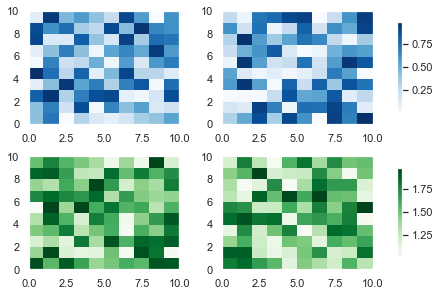
This code is similar to the one above but the plots of the same color are on the same row rather than the same column. I also shrank the colorbars to 80% of their default size by setting shrink=0.8.
Finally, let’s set the blue colorbar to be on the bottom of the heatmaps.

You can change the location of the colorbars with the location keyword argument in fig.colorbar(). The only difference between this plot and the one above is this line
fig.colorbar(pcm1, ax=axes[0, :], shrink=0.8, location='bottom')
If you increase the figsize argument, this plot will look much better – at the moment it’s quite cramped.
I recommend you play around with matplotlib colorbar placement. You have total control over how many colorbars you put on the Figure, their location and how many rows and columns they span. These are some basic ideas but check out the docs to see more examples of how you can place colorbars in matplotlib.
Matplotlib Subplot Grid
I’ve spoken about GridSpec a few times in this article. It is the underlying class that specifies the geometry of the grid that a subplot can be placed in.
You can create any shape you want using plt.subplots() and plt.subplot2grid(). But some of the more complex shapes are easier to create using GridSpec. If you want to become a total pro with matplotlib, check out the docs and look out for my article discussing it in future.
Summary
You can now create any shape you can imagine in matplotlib. Congratulations! This is a huge achievement. Don’t worry if you didn’t fully understand everything the first time around. I recommend you bookmark this article and revisit it from time to time.
You’ve learned the underlying classes in matplotlib: Figure, Axes, XAxis and YAxis and how to plot with respect to them. You can write shorter, more readable code by using these methods and ax.set() to add titles, xlabels and many other things to each Axes. You can create more professional looking plots by sharing the x-axis and y-axis and add legends anywhere you like.
You can create Figures of any size that include Subplots of any size – you’re no longer restricted to those that take up 1/xth of the plot. You know that to make the best plots, you should plan ahead and figure out the shape you are aiming for.
You know when to use plt.tight_layout() (ticks, labels and titles) and constrained_layout=True (legends and colorbars) and how to manually adjust spacing between plots with plt.subplots_adjust().
Finally, you can add colorbars to as many Axes as you want and place them wherever you’d like.
You’ve done everything now. All that is left is to practice these plots so that you can quickly create amazing plots whenever you want.
Where To Go From Here?
Do you wish you could be a programmer full-time but don’t know how to start?
Check out my pure value-packed webinar where I teach you to become a Python freelancer in 60 days or your money back!
https://tinyurl.com/become-a-python-freelancer
It doesn’t matter if you’re a Python novice or Python pro. If you are not making six figures/year with Python right now, you will learn something from this webinar.
These are proven, no-BS methods that get you results fast.
This webinar won’t be online forever. Click the link below before the seats fill up and learn how to become a Python freelancer, guaranteed.