
Welcome to the bonus content of “The Book of Dash”. 🤗
Here you’ll find additional examples of Plotly Dash components, layouts and style. To learn more about making dashboards with Plotly Dash, and how to buy your copy of “The Book of Dash”, please see the reference section at the bottom of this article.
This article covers Bootstrap position utility classes — the Bootstrap shorthand helper to make component layout faster and easier than ever. We’ll show you how to make components like this indicator component where the badge is positioned in the top right corner of the button.
But first, let’s learn more about the Bootstrap utility classes.
Dash Bootstrap Utility Classes
Bootstrap includes dozens of utility classes for showing, hiding, aligning, spacing, and styling content.
Bootstrap utility classes can be applied to any Dash component to quickly style them without the need to write custom CSS rules. Use the Bootstrap utility classes in the Dash component’s className prop.
For example, instead of using CSS in the style prop:
style={
    "backgroundColor": "blue",
    "padding": 16,
    "marginTop": 32,
    "textAlign": "center",
    "fontSize": 32,
}
You can use Bootstrap utilities in the className prop:
className="bg-primary p-1 mt-2 text-center h2",
👉 Recommended: See all the Bootstrap utility classes at the Dash Bootstrap Cheatsheet app. This handy cheatsheet is made by Ann Marie Ward, a co-author of “The Book of Dash”.

Feel free to watch Adam’s explainer video on Bootstrap and styling your app if you need to get up to speed!
Dash Bootstrap Position Utility Classes
Use these shorthand utilities for quickly configuring the position of an element. Arrange elements easily with the edge positioning utilities. The format is {property}-{position}.
Where property is one of:
top– for the vertical top positionstart– for the horizontal left position (in LTR)bottom– for the vertical bottom positionend– for the horizontal right position (in LTR)
Where position is one of:
0– for 0 edge position50– for 50% edge position100– for 100% edge position
In this example, we use utilities to position a square FontAwesome icon in each corner inside a dbc.Card.
💡 Note: The icon is positioned relative to the dbc.Card. We do this by adding className="position-relative to the dbc.Card component, and className="position-absolute" to the html.Div with the icon. We also set the position with the {property}-{position} class.

from dash import Dash, html
import dash_bootstrap_components as dbc

app = Dash(__name__, external_stylesheets=[dbc.themes.BOOTSTRAP,
                                           dbc.icons.FONT_AWESOME])

square = html.I(className="fas fa-square fs-3")

arrange_elements = dbc.Card(
    [
        html.Div(square,
                 className="position-absolute top-0 start-0"),
        html.Div(square,
                 className="position-absolute top-0 end-0"),
        html.Div(square,
                 className="position-absolute bottom-0 start-0"),
        html.Div(square,
                 className="position-absolute bottom-0 end-0")],
    className="position-relative",
    style={"height":200, "width":200},
)

app.layout = dbc.Container(arrange_elements)

if __name__ == "__main__":
    app.run(debug=True)
Dash Bootstrap Position Utility Classes – “translate-middle”
Now let’s look at how to put the icon in the corners like in the indicator component.
This class applies the transformations translateX(-50%) and translateY(-50%) to the element which, in combination with the edge positioning utilities, allows you to absolute center an element.

from dash import Dash, html
import dash_bootstrap_components as dbc

app = Dash(__name__, external_stylesheets=[dbc.themes.BOOTSTRAP, dbc.icons.FONT_AWESOME])

square = html.I(className="fas fa-square fs-3")

translate_middle = dbc.Card(
    [
        html.Div(square, className="position-absolute translate-middle top-0 start-0 "),
        html.Div(square, className="position-absolute translate-middle top-0 start-50"),
        html.Div(square, className="position-absolute translate-middle top-0 start-100"),
        html.Div(square, className="position-absolute translate-middle top-50 start-0"),
        html.Div(square, className="position-absolute translate-middle top-50 start-50"),
        html.Div(square, className="position-absolute translate-middle top-50 start-100"),
        html.Div(square, className="position-absolute translate-middle top-100 start-0"),
        html.Div(square, className="position-absolute translate-middle top-100 start-50"),
        html.Div(square, className="position-absolute translate-middle top-100 start-100"),
    ],
    className="position-relative",
    style={"height":200, "width":200},
)

app.layout = dbc.Container(translate_middle, className="p-5")

if __name__ == "__main__":
    app.run(debug=True)
Plotly Dash Bootstrap Indicator Components
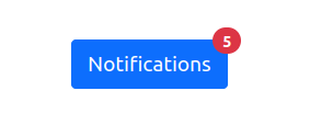
Indicator with a number
Here is the code to make the first indicator component shown above in the intro. Here the dbc.Badge is placed in the upper right corner relative to the dbc.Button component.
from dash import Dash, html
import dash_bootstrap_components as dbc
app = Dash(__name__, external_stylesheets=[dbc.themes.BOOTSTRAP, dbc.icons.FONT_AWESOME])
indicator = dbc.Button(
[
"Notifications",
dbc.Badge(
"5",
color="danger",
pill=True,
text_color="white",
className="position-absolute top-0 start-100 translate-middle",
),
],
color="primary",
className="position-relative",
)
app.layout = dbc.Container(indicator, className="p-5")
if __name__ == "__main__":
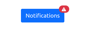
app.run(debug=True)Indicator with an icon
This indicator uses a FontAwesome icon instead of a number.
🌎 Recommended: Learn more about adding FontAwesome icons to your app in the Dash Bootstrap Components documentation.
Change the app above to use this indicator, and you will see the indicator with the icon:
indicator = dbc.Button(
    [
        "Notifications",
        dbc.Badge(
            [html.I(className="fas fa-triangle-exclamation")],
            color="danger",
            pill=True,
            text_color="white",
            className="position-absolute top-0 start-100 translate-middle",
        ),
    ],
    color="primary",
    className="position-relative",
)
Note that you can use any component as the “base” component. Instead of using a dbc.Button this example uses a dbc.Badge for both the base component and the indicator.
The advantage of using a dbc.Badge is that it does not have the focus ring styling of the dbc.Button and may work better in certain use cases.

indicator = dbc.Badge(
    [
        html.I(className="fas fa-bell fs-3"),
        dbc.Badge(
            "5",
            color="danger",
            pill=True,
            text_color="white",
            className="position-absolute top-0 start-100 translate-middle",
        ),
    ],
    color="primary",
    text_color="white",
    className="position-relative",
)
Indicator with a circle
This indicator does not have a number, it’s just a red circle placed in the upper right corner of the dbc.Button.

We create this circle by adding "p-2 bg-danger rounded-circle" to the className prop. The "p-2" adds padding and controls the size of the indicator. "bg-danger" sets the color to the Bootstrap named theme color "danger" which is a shade of red. "rounded-circle" sets the shape.
When you run this example, try changing the indicator size by using a different padding. The numbers range from "p-1" to "p-5". Or try changing the color to one of the other named theme colors, like "bg-info" or "bg-secondary".
indicator = dbc.Button(
    [
        "Profile",
        html.Div(
            className="position-absolute top-0 start-100 translate-middle p-2 bg-danger rounded-circle"
        ),
    ],
    color="primary",
    className="position-relative",
)
Styling Other Components with Position Utilities
The position utilities are not just for indicator components. Here we use it to jazz up a dbc.Card component. Learn more about Dash Bootstrap Card components in the cards article.

indicator = dbc.Card(
[
html.Div("Employee of the Month", className="text-center"),
html.Img(
src="https://todaysmama.com/.image/t_share/MTU5OTEwMzkyMDIyMTE1NzAz/cookie-monster.png",
style={"height": 65},
className="position-absolute top-0 start-0 translate-middle rounded-circle img-fluid",
),
],
body=True,
color="success",
className="position-relative text-white",
style={"width": 200, "height": 75},
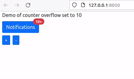
)Indicator With Dynamic Overflow
In this example, we’ll make the badge dynamic with a callback. We’ll show how to create an indicator where numbers above a certain threshold will be shown as "+".
For example, if the overflow is 10, then instead of showing numbers above 10 it will show “10+“.
from dash import Dash, dcc, html, Input, Output, State, ctx
import dash_bootstrap_components as dbc

OVERFLOW = 10

app = Dash(__name__, external_stylesheets=[dbc.themes.BOOTSTRAP])

badge = html.Div(
    [
        dcc.Store(id="counter", data=10),
        dbc.Button(
            [
                "Notifications",
                dbc.Badge(
                    color="danger",
                    pill=True,
                    text_color="white",
                    className="position-absolute top-0 start-100 translate-middle",
                    id="counter-display"
                ),
            ],
            color="primary",
            className="position-relative",
        )
    ], className="my-2"
)

plus_minus_buttons = html.Div(
    [
        dbc.Button("+", id="plus", size="sm", className="me-2"),
        dbc.Button("-", id="minus", size="sm")
    ]
)

app.layout = dbc.Container(
    [
        html.Div("Demo of counter overflow set to 10"),
        badge, plus_minus_buttons
    ], fluid=True)


@app.callback(
    Output("counter-display", "children"),
    Output("counter", "data"),
    Input("plus", "n_clicks"),
    Input("minus", "n_clicks"),
    State("counter", "data"),
)
def update_counters(n_plus, n_minus, counter):
    if ctx.triggered_id == "plus":
        counter +=1
    if ctx.triggered_id == "minus":
        counter -=1
    counter_display = f"{OVERFLOW}+" if counter >= OVERFLOW else counter
    return counter_display, counter


if __name__ == "__main__":
    app.run_server(debug=True)
Plotly Dash Example Index
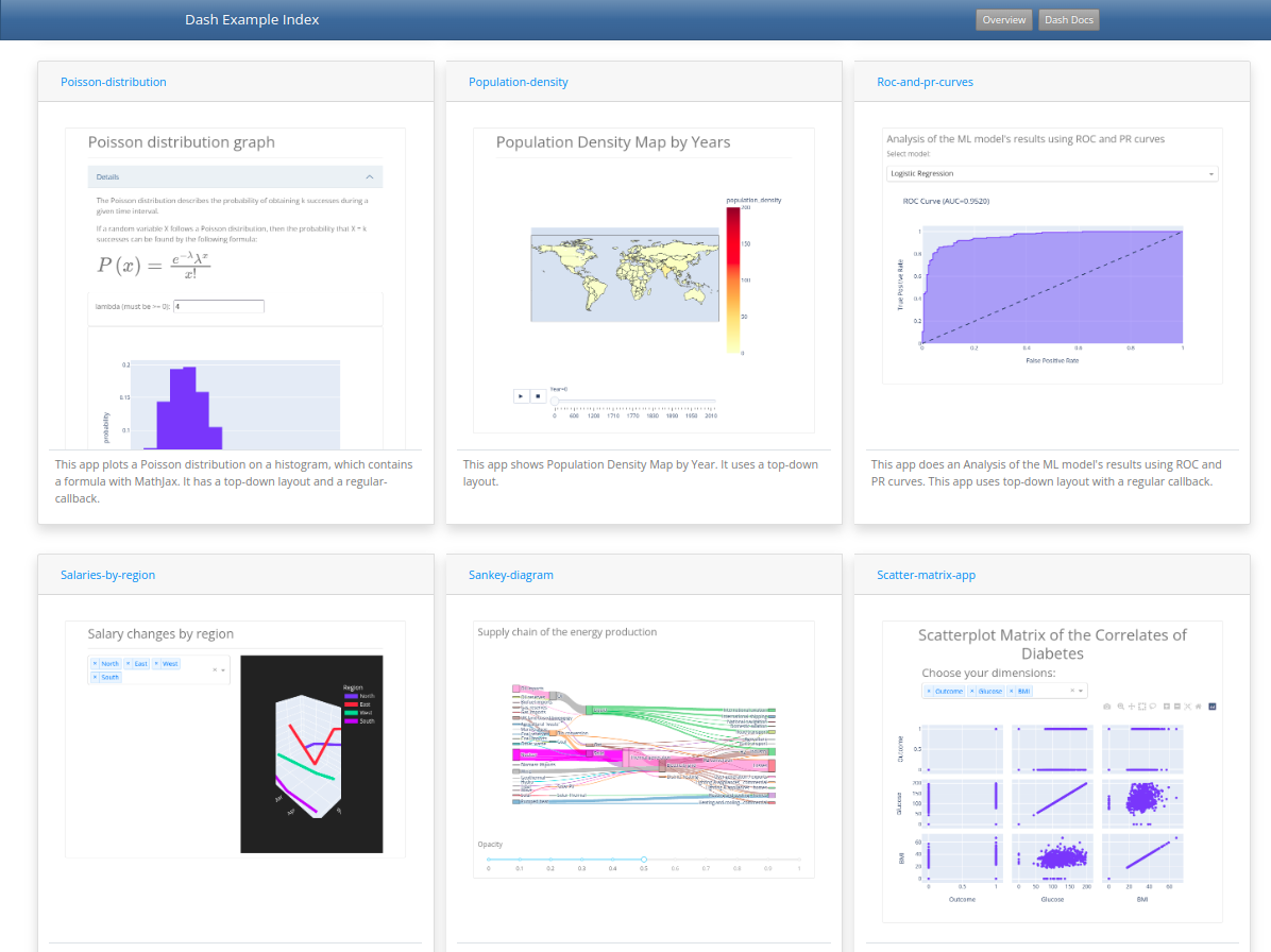
See more examples of Bootstrap utility classes live! Check out the interactive example apps in the Dash Example Index
Reference
Order Your Copy of “The Book of Dash” Today!

- Dash documentation – tutorial. Getting Started with Dash
- Dash Example Index. Lots of sample apps to get you started with Dash!
- Dash Bootstrap Components documentation
- Dash Bootstrap Cheatsheet A cheatsheet for using Bootstrap utility classes with Dash
- Dash Bootstrap Theme Explorer. A guide for styling Plotly Dash apps with a Bootstrap theme
The Book of Dash Authors
Feel free to learn more about the book’s coauthors here:
Ann Marie Ward:
- 👩💻 GitHub: https://github.com/AnnMarieW
- 💬 Dash Forum: https://community.plotly.com/u/annmariew/summary
Adam Schroeder:
- ▶️ YouTube CharmingData: https://www.youtube.com/c/CharmingData
Chris Mayer:
- 🐍 Python + Crypto Email Academy: https://blog.finxter.com/subscribe/