
Welcome to the bonus content of “The Book of Dash“. 🤗
Here you will find additional examples of Plotly Dash components, layouts and style. To learn more about making dashboards with Plotly Dash, and how to buy your copy of “The Book of Dash”, please see the reference section at the bottom of this article.
💡 This article will focus on the dcc.Slider and the dcc.RangeSlider components. A slider is a way for users to select numeric input between a minimum and maximum value.
Plotly Dash dcc.Slider
Here is a minimal Dash app with a dcc.Slider component.

from dash import Dash, dcc, html

app = Dash(__name__)

slider = dcc.Slider(min=0, max=20, step=5, value=10)

app.layout = html.Div(slider, style={"margin": 30})

if __name__ == "__main__":
    app.run(debug=True)
In the app above, the slider is defined as:
slider = dcc.Slider(min=0, max=20, step=5, value=10)
Rather than using keyword arguments for the min, max and step, you could use positional arguments:
slider = dcc.Slider(0, 20, 5, value=10)
When using positional arguments, make sure you know the correct order (position) of each property. You can use the slider properties page in the Dash docs to see the order.
Here’s a print out:
    min (number; optional)...

    max (number; optional)...

    step (number; optional)...

    marks (dict; optional)...

    value (number; optional)...
Plotly Dash dcc.RangeSlider
The dcc.RangeSlider component allows the user to select a range of values between the min and the max values. This is different from the slider where the min value is predefined by code and cannot be changed through user interaction in the dashboard.

slider = dcc.RangeSlider(0, 20, 2, value=[6, 16])
Plotly Dash dcc.Slider with a Label
It’s common to add a label with an html.Div component, however if you use an html.Label (or dbc.Label with dash-bootstrap-components), there are several advantages:
- The label text is not only visually associated with its corresponding text input; it is programmatically associated with it too. This means that, for example, a screen reader will read out the label when the user is focused on the form input, making it easier for an assistive technology user to understand what data should be entered.
- When a user clicks or touches/taps a label, the browser passes the focus to its associated input (the resulting event is also raised for the input). That increased hit area for focusing the input provides an advantage to anyone trying to activate it — including those using a touch-screen device.
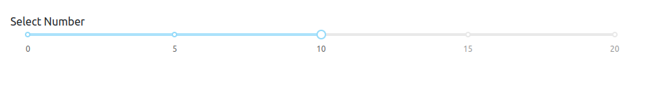
In the example below, note that the html.Label must include the htmlFor prop set to the same id as the slider.
slider = html.Div(
    [
        html.Label("Select Number", htmlFor="my-slider"),
        dcc.Slider(min=0, max=20, step=5, value=10, id="my-slider")
    ]
)
Plotly Dash Sliders with Marks
You can put marks (ie labels) along the slider rail.
For example:

Plotly Dash Sliders with Marks
slider = dcc.Slider(
    1, 12, 3, value=6, marks={1: "Jan", 3: "Mar", 6: "Jun", 9: "Sep", 12: "Dec"}
)
Plotly Dash Sliders with marks at an angle
You can customize each mark with CSS using the style prop.
This slider has the marks displayed on a 45-degree angle to make them more readable on small screens or narrow columns.
See the dash docs for more examples of customizing and styling the marks.

slider = dcc.RangeSlider(1, 12, 1, value=[3, 9],
    marks={
        i: {
            "label": f"Month {i}",
            "style": {"transform": "rotate(45deg)", "white-space": "nowrap"},
        }
        for i in range(1, 13)
    },
)
Style and Display of Slider
Styling Slider with Bootstrap Theme
If you are using dash-bootstrap-components, you will notice that Bootstrap theme is not automatically applied to dash-core-components such as the dcc.Slider.
However, a co-author of “The Book of Dash” has developed a stylesheet that will update the dcc components with colors and fonts of your selected Bootstrap theme. Simply include this stylesheet and add className="dbc" to your app.
Here are some examples:
dcc.Slider with a Bootstrap Pulse Theme

dcc.Slider with a Bootstrap Cyborg Theme

from dash import Dash, dcc
import dash_bootstrap_components as dbc

# stylesheet with the .dbc class from dash-bootstrap-templates library
dbc_css = "https://cdn.jsdelivr.net/gh/AnnMarieW/dash-bootstrap-templates/dbc.min.css"

# Bootstrap Pulse theme
app = Dash(__name__, external_stylesheets=[dbc.themes.PULSE, dbc_css])

# Bootstrap Cyborg theme
# app = Dash(__name__, external_stylesheets=[dbc.themes.CYBORG, dbc_css])

slider = dcc.Slider(min=0, max=20, step=5, value=10, className="m-4")

app.layout = dbc.Container([slider], fluid=True, className="dbc")

if __name__ == "__main__":
    app.run(debug=True)
Display Two Sliders Side-by-Side
One of the easiest ways to design your app’s layout is to use the stylesheets from libraries such as dash-bootstrap-components or dash-mantine-components.
In this example, we place the sliders in one row and two columns using the dbc.Row() and dbc.Col() components.

from dash import Dash, dcc
import dash_bootstrap_components as dbc

# stylesheet with the .dbc class from dash-bootstrap-templates library
dbc_css = "https://cdn.jsdelivr.net/gh/AnnMarieW/dash-bootstrap-templates/dbc.min.css"

app = Dash(__name__, external_stylesheets=[dbc.themes.MINTY, dbc_css])

slider = dcc.Slider(min=0, max=20, step=5, value=10, className="m-4")
range_slider = dcc.RangeSlider(0, 20, 2, value=[6, 16], className="m-4")

app.layout = dbc.Container(
    [dbc.Row([dbc.Col(slider), dbc.Col(range_slider)])], fluid=True, className="dbc"
)

if __name__ == "__main__":
    app.run(debug=True)
Plotly Dash App – Connecting Slider to Plotly figures
In this app, a user can update the figure by selecting the year on the slider.
The callbacks make this app interactive. This example also shows how to use a tooltip to display the selected value of the slider.
👉 Recommended Resource: See more apps in the Dash Example Index
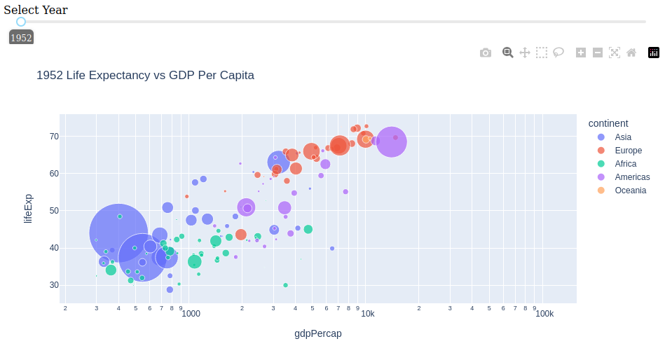
from dash import Dash, dcc, html, Input, Output
import plotly.express as px

df = px.data.gapminder()
years = df.year.unique()

app = Dash(__name__)

slider = html.Div(
    [
        html.Label("Select Year", htmlFor="years"),
        dcc.Slider(
            min=years[0],
            max=years[-1],
            step=5,
            value=years[0],
            id="years",
            marks=None,
            tooltip={"placement": "bottom", "always_visible": True},
        ),
    ]
)

app.layout = html.Div([slider, dcc.Graph(id="graph")])


@app.callback(Output("graph", "figure"), Input("years", "value"))
def update_figure(yr):
    return px.scatter(
        df.query(f"year=={yr}"),
        x="gdpPercap",
        y="lifeExp",
        size="pop",
        color="continent",
        log_x=True,
        size_max=60,
        title=f"{yr} Life Expectancy vs GDP Per Capita",
    )


if __name__ == "__main__":
    app.run(debug=True)
👉 Recommended Tutorial: Plotly Dash Button Component
Also, you may find this tutorial interesting:
👉 Recommended Tutorial: Plotly Dash Bootstrap Card Component
Reference
Order Your Copy of “The Book of Dash” Today!

- Dash documentation – tutorial. Getting Started with Dash
- Dash Example Index. Sample apps with sliders
- Dash documentation – dcc.Slider
- Dash Bootstrap Components documentation – Themes
- Dash Bootstrap Theme Explorer. A guide for styling Plotly Dash apps with a Bootstrap theme
The Book of Dash Authors
Feel free to learn more about the book’s coauthors here:
Ann Marie Ward:
- 👩💻 GitHub: https://github.com/AnnMarieW
- 💬 Dash Forum: https://community.plotly.com/u/annmariew/summary
Adam Schroeder:
- ▶️ YouTube CharmingData: https://www.youtube.com/c/CharmingData
Chris Mayer:
- 🐍 Python + Crypto Email Academy: https://blog.finxter.com/subscribe/